What's New in NativeScript 6.5
NativeScript 6.5 is here - and with it some improvements in creation and styling of Tabs as well as experimental support for KotlinJS.
Welcome to another release of your favorite cross-platform app dev framework! Version 6.5 of NativeScript brings you:
- Dynamic Creation of Tabs & Bottom Navigation
- New Styling Properties in TabStrip
- Advanced iOS Styling Options in Tabs
- DoubleTapGestureEventData
- Experimental KotlinJS Support
As always, update to 6.5 with...
npm install -g nativescript
...and then upgrade your apps.
Dynamic Creation of Tabs and Bottom Navigation
The Tabs and BottomNavigation components were introduced as beta components in NativeScript 6.1. With this release, both components are further expanding their functionality by providing means for creating them programmatically.
To support the dynamic creation of the components, two new properties were introduced as part of the TabStrip sub-component. The first is the iconSource which is used to programmatically create the TabStrip icon (supporting a resource file via res://, local file via ~/, and icon font via font://). The second property is called iconClass and its purpose is to set the CSS class that will be applied to the icon (a must if you want to use an icon font with font://).
Example for dynamic creation of Tabs
let tabs = new Tabs();
let myTabStrip = new TabStrip();

let tabStripItem1 = new TabStripItem();
tabStripItem1.title = "Tab 1";
tabStripItem1.iconSource = `font://${String.fromCharCode(0xf053)}`;
tabStripItem1.iconClass = "fas"; // e.g., Font Awesome
let tabStripItem2 = new TabStripItem();
tabStripItem2.title = "Tab 2";
tabStripItem2.iconSource = `font://${String.fromCharCode(0xf070)}`;
tabStripItem2.iconClass = "fas"; // e.g., Font Awesome

myTabStrip.items = [tabStripItem1, tabStripItem2];

let tabContentItem1 = new TabContentItem();
tabContentItem1.content = createContent("Content 1");
let tabContentItem2 = new TabContentItem();
tabContentItem2.content = createContent("Content 2");

let contentItems = [tabContentItem1, tabContentItem2];

tabs.tabStrip = myTabStrip;

// Note: The number of content items must be equal to the number of strip items
tabs.items = contentItems;
New Styling Properties in TabStrip
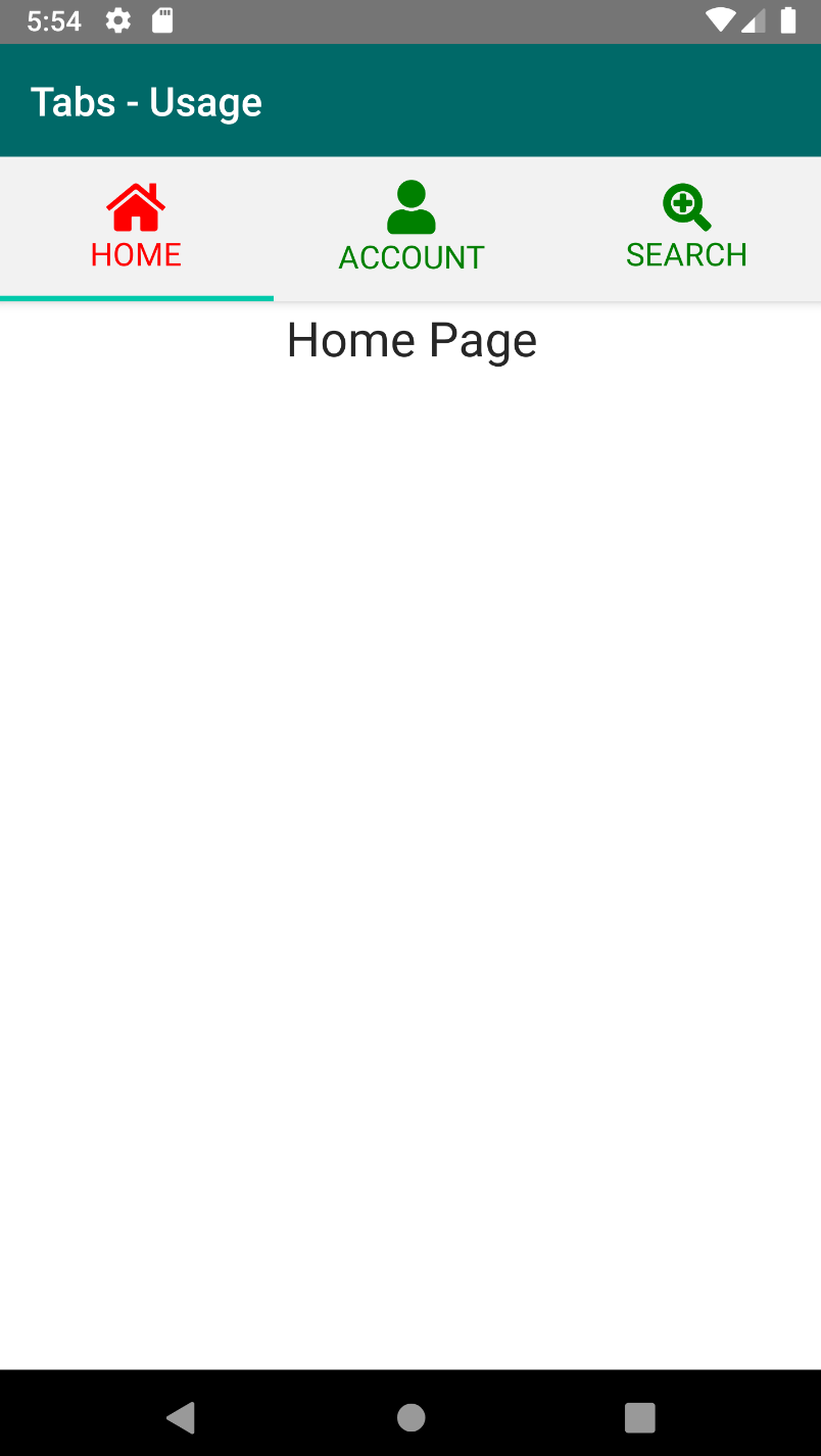
We are introducing two new properties for the TabStrip component: selectedItemColor and unSelectedItemColor. The reason to introduce these properties is to have the ability to easily modify the color of TabStrip items' icon and text. Doing this also follows the Material Design Guidelines for having the icon and text color be the same.
Using these new properties is quite easy. Suppose we have a simple Tabs component and we want to make the selectedItemColor red and the unSelectedItemColor green:
<Tabs selectedIndex="1">
    <TabStrip selectedItemColor="red" unSelectedItemColor="green">
            ...
    </TabStrip>
</Tabs>
When we build our app we will observe that the icon and the text now have the specified colors we set in the markup:

Advanced iOS Styling Options in Tabs
Prior to version 6.5, the Tabs component had limited styling possibilities for iOS. Now the iOS styling options are expanded greatly by providing a property for tab strip alignment and also by providing options to apply extended CSS styling.
To change the alignment for TabStrip, set the iOSTabBarItemsAlignment property of the Tabs component.
<!-- justify is now the defealt value for iOSTabBarItemsAlignment property -->
<Tabs iOSTabBarItemsAlignment="justify">
The new property supports the following values:
leading : tab items are aligned to the left

justified : tab strip is split equally to all the tab items

center : tabs items are aligned in the center

centerSelected : tab items move to make the selected tab in the center

The above property now provide means for changing the font, background-color, color, and TextTransform. Note that there are some limitations:
- The iOS
MDCTabBarsupports only two styles of the tab strip items -normalandselected, which means that you cannot have different styles for two items with the same normal state. - The supported
TextTransformvalues for theTabStriparenone,initialanduppercase. - If the
iOSTabBarItemsAlignmentis set to something different thanjustifyand you want to set the background of the selected item, you can achieve it by setting:activestyle to theTabStripitem, but the selection highlight indicator will not be shown in that case.
DoubleTapGestureEventData
A community-driven PR (thank you MCurran16!) has extended the double-tap event data which up until now was of a generic type (GestureEventData). The newly introduced DoubleTapGestureEventData extends the common data by providing two methods for accessing the coordinates of the triggered double tap event. The methods are getX() and getY() and as expected they will return X and Y coordinates for the current interaction. Тhe values are in device pixels based on the specific platform coordinate system.
Experimental KotlinJS Support
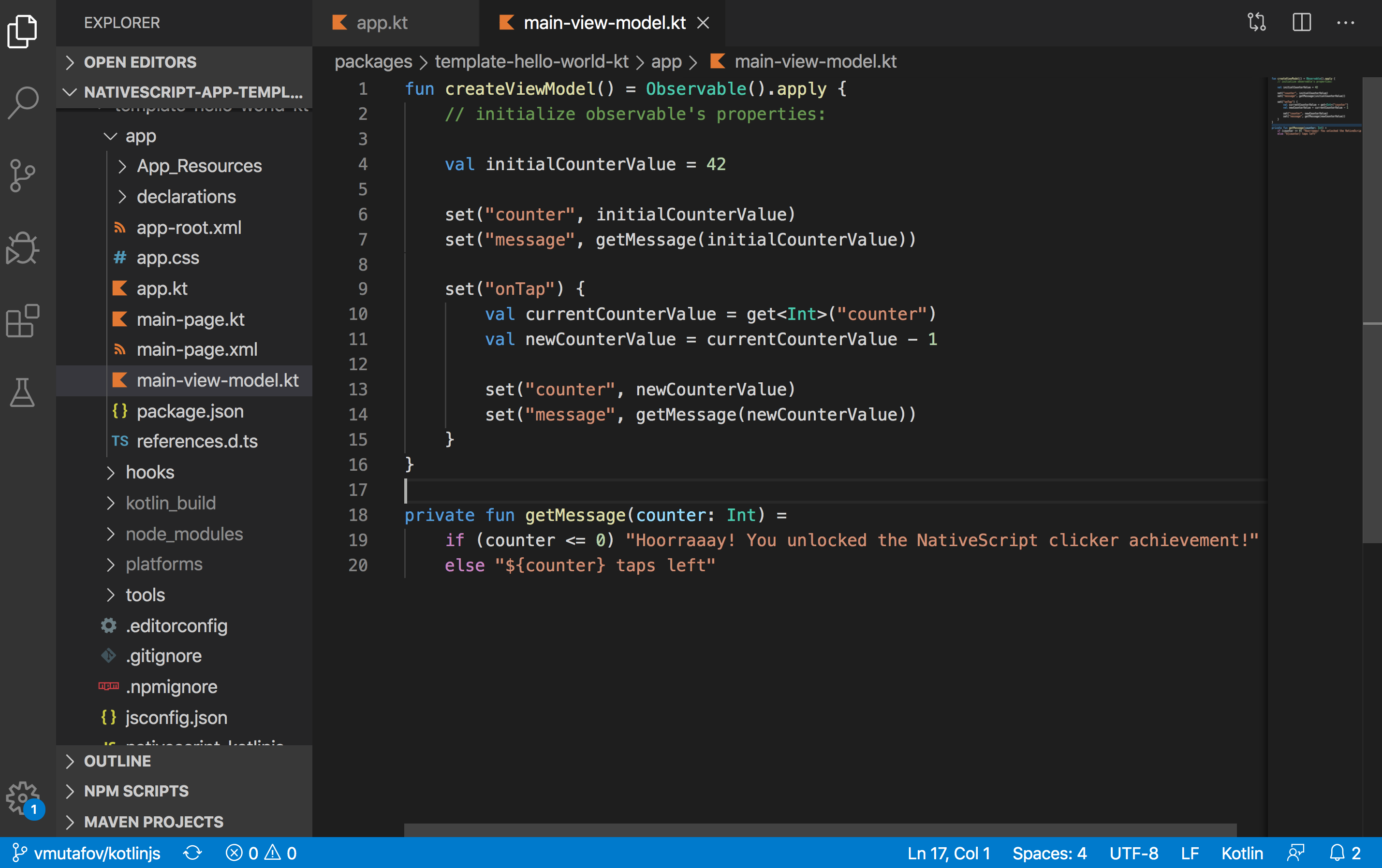
With this release we continue our support for Kotlin but this time on the front end side of app development. We are introducing experimental support for writing NativeScript applications with KotlinJS.
We must say that this is highly experimental and subject to change but nevertheless, we would be happy for the community to take a look at the HelloWorld sample with KotlinJS. Please, follow the instructions in the README.md file to use it. Additional documentation will follow in the near future!
