NativeScript Blog
Tinder-style Cards with NativeScript - Love at First Swipe
Jen Looper
April 13, 2017
Create a Tinder-style swipable card interface with NativeScript
Anyone who knows me, my design aesthetic, and my ideas about UI and UX knows that:
1. I like pretty colors
2. I like a LOT of pretty colors all over my apps
3. I like cards
4. If there are cards with pretty colors it’s 💰
Another fun fact about me is that I was previously employed at a dating web site, where we matched eligible singles…sort of like Tinder except it was more matrimonial-oriented than otherwise. Dating sites have interesting UI challenges. It's not surprising that a dating app should pioneer a really revolutionary UI: swipable cards. There is something really satisfying both physically and emotionally in swiping right and left to organize your love life:

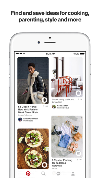
The famous Tinder swipable cards interface took the app store by storm a few years ago, and since then other apps have adopted this type of sortable card. The older Jelly app and Pinterest are some good examples:
Since NativeScript layouts support gestures and animations, it isn’t too hard to create such a swipable interface. My first attempt at creating a Tinder-style card interface occurred when I gave a lightning talk at Boston Ignite last year. The premise behind my app was that, by digging into the 23AndMe Genetics API, you could find your perfect match based on your percentage of Neanderthal DNA. Please don’t ask why I am fascinated by Neanderthals, but I thought that they might have liked to have their own dating app. Neanderthals need love too.

Initially, I created a card-swiping format that had one card dropped into the screen, and then swiped away to the left or the right. This way, the card is recycled, but only one card appears at a time. I shared my code on NativeScriptSnacks.com, but you can see right away that there are some problems with the layout.

First, the app doesn’t behave like Tinder, in that only one card appears at a time. Second, the cards sometimes drop into view before the image is rendered, leading to a choppy interface. We can do better! A careful observation of Tinder shows that a stack of cards is presented to the user as a visual clue that there is an abundance of choices to be made.
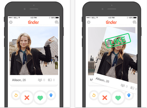
Notice also the ability of the user to swipe the top card and instantly be shown the card along with a ‘like’ or ‘dislike’ stamp. This is a clue that we need to build our screen dynamically; the data must be placed on the cards as the interface itself is built. For each image, a card is drawn and placed in a layout. Additionally, the cards must all be placed on top of each other. This calls for a dynamically-generated absolute layout.
In the `app.css` file, I associate the color class with some pretty colors I found on colourlovers.com:
Then, I create a ‘shell’ of XML layout markup to hold the cards.
Then, build the dynamic components - the grid and labels - and place them into the AbsoluteLayout by leveraging `addChild` :
Finally, use NativeScript’s Gestures module to handle the actual card swiping. This module returns args.direction of either 1 or 0, right or left. So, depending on the swipe direction, a series of animations occurs. First, the stamp label, which is normally set to opacity=0, appears briefly, showing red or green “thanks” or “no thanks” stamps. Then, the card itself animates, pushing off to the right or left and down using translate to make it move. It’s pretty straightforward, and you could tweak the animations to make the card sweep to the left or right or snap back, depending on how responsive your want your interface to behave.
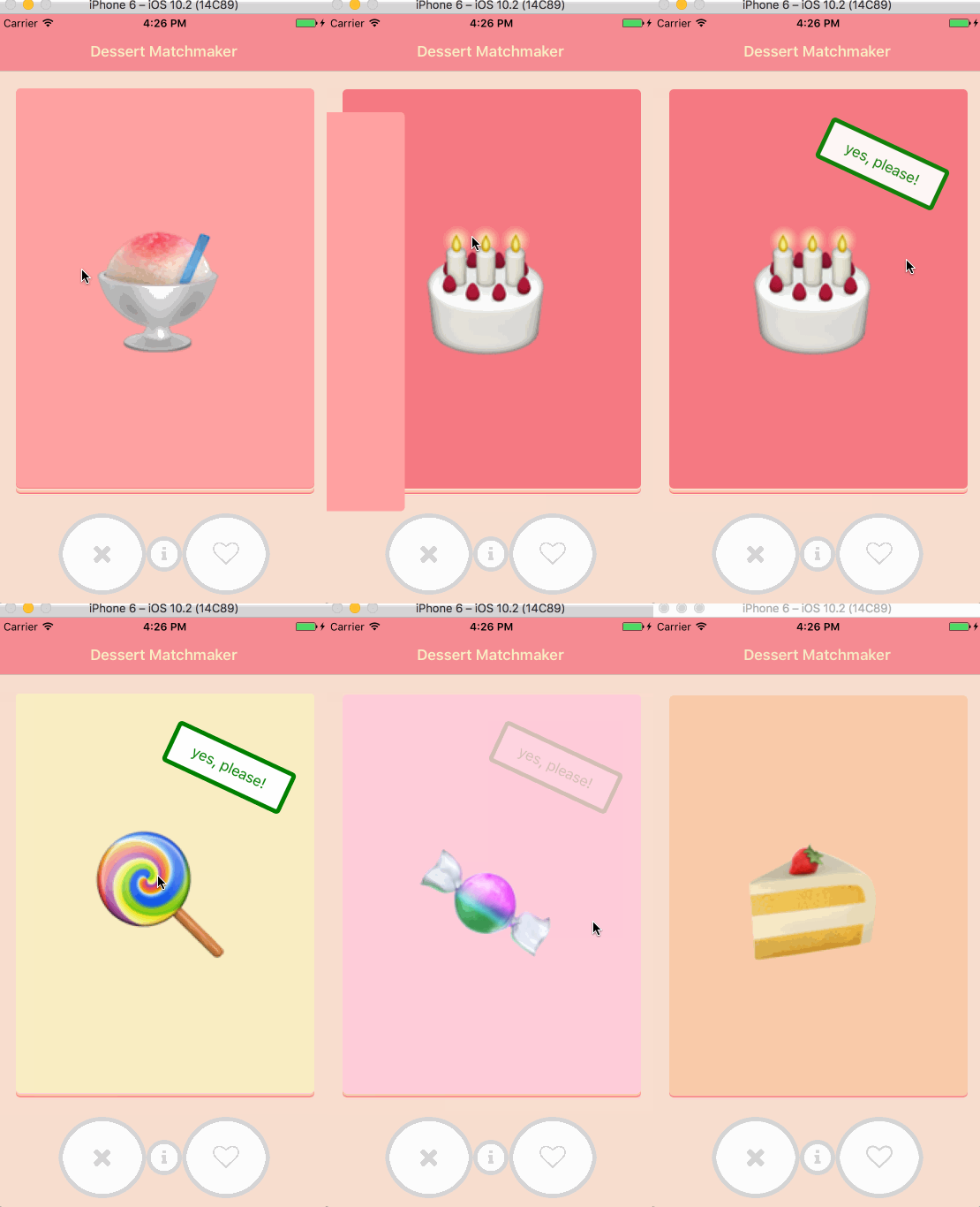
Animating these cards is pretty easy, using NativeScript’s Gesture and Animate modules. To ensure the performant nature of this dynamic layout, I’d recommend sending batches of data at a time to the card stack (say, layout ten cards at once), and at the end of the swiping routines, layout another ten cards. Give it a try! Here’s the final result:
The source code for these cards is here.
Have you fallen in love with NativeScript? Reach out to us here in the comments or ping us on Twitter @nativescript to tell us your story!
1. I like pretty colors
2. I like a LOT of pretty colors all over my apps
3. I like cards
4. If there are cards with pretty colors it’s 💰
Another fun fact about me is that I was previously employed at a dating web site, where we matched eligible singles…sort of like Tinder except it was more matrimonial-oriented than otherwise. Dating sites have interesting UI challenges. It's not surprising that a dating app should pioneer a really revolutionary UI: swipable cards. There is something really satisfying both physically and emotionally in swiping right and left to organize your love life:

The famous Tinder swipable cards interface took the app store by storm a few years ago, and since then other apps have adopted this type of sortable card. The older Jelly app and Pinterest are some good examples:

Since NativeScript layouts support gestures and animations, it isn’t too hard to create such a swipable interface. My first attempt at creating a Tinder-style card interface occurred when I gave a lightning talk at Boston Ignite last year. The premise behind my app was that, by digging into the 23AndMe Genetics API, you could find your perfect match based on your percentage of Neanderthal DNA. Please don’t ask why I am fascinated by Neanderthals, but I thought that they might have liked to have their own dating app. Neanderthals need love too.

Initially, I created a card-swiping format that had one card dropped into the screen, and then swiped away to the left or the right. This way, the card is recycled, but only one card appears at a time. I shared my code on NativeScriptSnacks.com, but you can see right away that there are some problems with the layout.

First, the app doesn’t behave like Tinder, in that only one card appears at a time. Second, the cards sometimes drop into view before the image is rendered, leading to a choppy interface. We can do better! A careful observation of Tinder shows that a stack of cards is presented to the user as a visual clue that there is an abundance of choices to be made.

Notice also the ability of the user to swipe the top card and instantly be shown the card along with a ‘like’ or ‘dislike’ stamp. This is a clue that we need to build our screen dynamically; the data must be placed on the cards as the interface itself is built. For each image, a card is drawn and placed in a layout. Additionally, the cards must all be placed on top of each other. This calls for a dynamically-generated absolute layout.
Scaffolding the Interface
Card interfaces can be used for a lot more than simply making cool dating apps. Let’s learn how to build them by creating a food matchmaker. Imagine if a child could pre-order his or her lunch from Mom and Dad in the morning by swiping left on the broccoli, and swiping right on the PBJ. Or, in this case, by selecting exactly which desserts you want after dinner, always a critical moment of choice.
To begin with, I scaffolded a basic app using Angular and NativeScript. Since this is a dessert-matchmaking app, in my service, I created a basic array of emoji. Each emoji is placed on a colored card.import { Injectable } from "@angular/core";
import { Emoji } from "./emoji";
@Injectable()
export class CardService {
private emoji = new Array<Emoji>(
{ code: '🍮', color: 'b1' },
{ code: '🍡', color: 'b2' },
{ code: '🍨', color: 'b3' },
{ code: '🍩', color: 'b4' },
{ code: '🍪', color: 'b5' },
{ code: '🍰', color: 'b5' },
{ code: '🍬', color: 'b1' },
{ code: '🍭', color: 'b2' },
{ code: '🎂', color: 'b3' },
{ code: '🍧', color: 'b4' },
{ code: '🍫', color: 'b5' },
{ code: '🍦', color: 'b6' }
);
getEmoji(): Emoji[] {
return this.emoji;
}
}
In the `app.css` file, I associate the color class with some pretty colors I found on colourlovers.com:
.b1 {
background-color: #FFCCDA;
}
.b2 {
background-color: #FAEEC3;
}
.b3 {
background-color: #F67982;
}
.b4 {
background-color: #FFA1A1;
}
.b5 {
background-color: #FACBAA;
}
.b6 {
background-color: #F67982;
}
Then, I create a ‘shell’ of XML layout markup to hold the cards.
<StackLayout>
<AbsoluteLayout horizontalAlignment="center" paddingTop="30" #absolutelayout>
<GridLayout width="100%" style="z-index:1" columns="*,*" horizontalAlignment="center">
<Label #no col="0" verticalAlignment="center" text="no, thanks!" class="no"></Label>
<Label #yes col="1" text="yes, please!" class="yes"></Label>
</GridLayout>
</AbsoluteLayout>
</StackLayout>
Animating the Swipe
Next, we need to complete the layout of the cards as a stack and get the data ready to place into the cards. Grab the id of the elements using `@ViewChild` :@ViewChild("absolutelayout") al: ElementRef;
@ViewChild("yes") yes: ElementRef;
@ViewChild("no") no: ElementRef;
...
ngOnInit() {
this.emoji = this.cardService.getEmoji();
//initial card
this.code = this.emoji[this.i].code;
//get ready for the swiping!
for (var key in this.emoji) {
this.handleSwipe(key);
}
}
Then, build the dynamic components - the grid and labels - and place them into the AbsoluteLayout by leveraging `addChild` :
handleSwipe(key: any) {
this.i--;
let grid = new GridLayout();
let emoji = new Label();
let yes = <Label>this.yes.nativeElement;
let no = <Label>this.no.nativeElement;
let absolutelayout = <AbsoluteLayout>this.al.nativeElement;
let swipeleft = <Button>this.swipeleft.nativeElement;
let swiperight = <Button>this.swiperight.nativeElement;
//set the emoji on the card
emoji.text = this.emoji[key].code;
//build the grid which is the card
grid.cssClass = 'card ' + this.emoji[key].color;
grid.id = 'card' + Number(key);
grid.marginTop = this.i;
//add the emoji to the grid, and the grid to the absolutelayout
grid.addChild(emoji);
absolutelayout.addChild(grid)
...
}
Finally, use NativeScript’s Gestures module to handle the actual card swiping. This module returns args.direction of either 1 or 0, right or left. So, depending on the swipe direction, a series of animations occurs. First, the stamp label, which is normally set to opacity=0, appears briefly, showing red or green “thanks” or “no thanks” stamps. Then, the card itself animates, pushing off to the right or left and down using translate to make it move. It’s pretty straightforward, and you could tweak the animations to make the card sweep to the left or right or snap back, depending on how responsive your want your interface to behave.
grid.on(GestureTypes.swipe, function (args: SwipeGestureEventData) {
if (args.direction == 1) {
//right
yes.animate({ opacity: 0, duration: 100 })
.then(() => yes.animate({ opacity: 1, duration: 100 }))
.then(() => yes.animate({ opacity: 0, duration: 100 }))
.then(() =>
grid.animate({ translate: { x: 1000, y: 100 } })
.then(function () { return grid.animate({ translate: { x: 0, y: -2000 } }); })
.catch(function (e) {
console.log(e.message);
})
)
.catch((e) => {
console.log(e.message);
});
}
else {
//left
no.animate({ opacity: 0, duration: 100 })
.then(() => no.animate({ opacity: 1, duration: 100 }))
.then(() => no.animate({ opacity: 0, duration: 100 }))
.then(() =>
grid.animate({ translate: { x: -1000, y: 100 } })
.then(function () { return grid.animate({ translate: { x: 0, y: -2000 } }); })
.catch(function (e) {
console.log(e.message);
})
)
.catch((e) => {
console.log(e.message);
});
}
});
Animating these cards is pretty easy, using NativeScript’s Gesture and Animate modules. To ensure the performant nature of this dynamic layout, I’d recommend sending batches of data at a time to the card stack (say, layout ten cards at once), and at the end of the swiping routines, layout another ten cards. Give it a try! Here’s the final result:

The source code for these cards is here.
Have you fallen in love with NativeScript? Reach out to us here in the comments or ping us on Twitter @nativescript to tell us your story!