Telerik UI for NativeScript Preview 2 is here: introducing RadListView
A new component joins the Telerik UI for NativeScript party: welcome RadListView and its powerful set of features directly coming from the native Telerik UI for iOS and Telerik UI for Android counterparts.
Load on demand
This feature is particularly useful when your data comes from a remote source and you don't want to load it all at once. Consider a mobile application store which lists the apps in a particular category. By scrolling down the list items are continuously added but never loaded all at once. Load on demand can also be adjusted to display a 'Load more...' button at the end of the scrollable list so that users manually trigger the data request.
Item layouts
RadListView supports three different kinds of item layouts:
- Linear (stacked) layout - items are linearly ordered either horizontally or vertically depending on the scrolling direction
- Grid layout - items are ordered in columns or rows depending on the scrolling direction. The number of rows or columns must be predefined.
- Staggered grid layout - this is the most sophisticated item layout type. Here items are ordered similarly to what the Grid layout whereas each item is directly positioned below its scrolling direction predecessor. Here's a real-life example of how this looks like:

Each item layout additionally supports two different scrolling directions: horizontal and vertical.
Item reorder
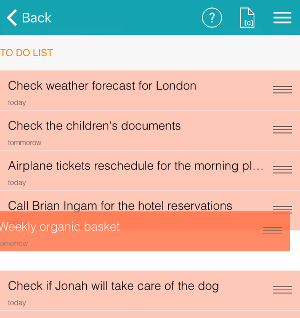
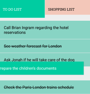
A popular scenario in which the "item reorder" feature is useful is a list of TO-DO items which can be prioritized. RadListView let's you do this out-of-the-box by setting a single property. You also get a set of dedicated events that fire each time an item is reordered and give you the old and the new index.
Swipe to execute
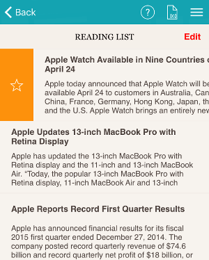
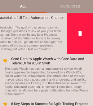
The swipe-to-execute mechanism allows you to implement specific actions for each of the items visualized in the control. Many popular e-mail apps implement this approach to allow their users to delete or archive items by swiping left or right. The swipe-to-execute feature is highly customizable allowing to either stick the item being swiped to a given offset and reveal a set of predefined actions, or simply perform an action when the user releases the item.
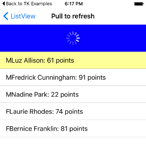
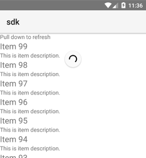
Pull to refresh
A very popular UX pattern which allows your end users to refresh the data list by pulling it down:
Item animations
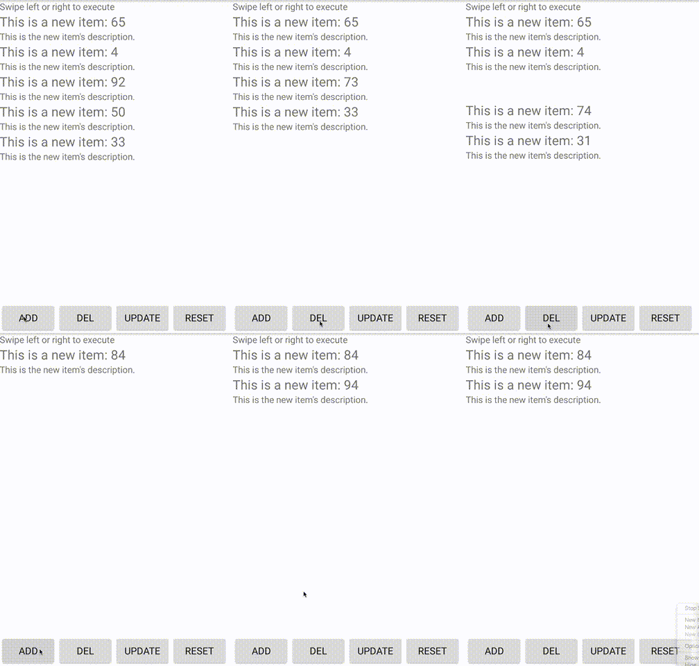
Item animations enable to add a finishing touch to the UX of your mobile application by making your data list animate changes in the data source. When items are added or deleted their visual representation will be elegantly animated into our out of the viewport:
Observable array
The ObservableArray module is part of the core NativeScript framework and represents a collection that fires notifications about its internal state. RadListView knows how to play nice with an ObservableArray so you don't need to do anything once you have an ObservableArray as a source for your list and the data items change.
In conclusion
We are really excited about this first version of RadListView for NativeScript and can promise you that there's a lot more to come. You should definitely check out the new version of Telerik UI for NativeScript available on NPM and make sure to let us know what you think by using
- Telerik forums: http://www.telerik.com/forums/nativescript-ui
- Our GitHub repo: https://github.com/telerik/nativescript-ui-samples
Additionally, don't forget to take a look at the online documentation for how-tos and getting started guides:
http://docs.telerik.com/devtools/nativescript-ui
Enjoy!