Tablet support for NativeScript with Angular
NativeScript has great tablet support baked in, but currently only for apps not using Angular. This post tries to offer some ideas that you can build on (or use as is) to support tablets in your Angular Native app.
For one of my apps I had two tablet requirements that needed to be satisfied within a Universal App (one binary):
- Split view, where 'master' and 'detail' are shown side by side.
- Custom styles (larger text, buttons, padding, etc).
Let me show you what my approach was for both of these and please don't hesitate sharing your ideas in the comments!
1. Split view
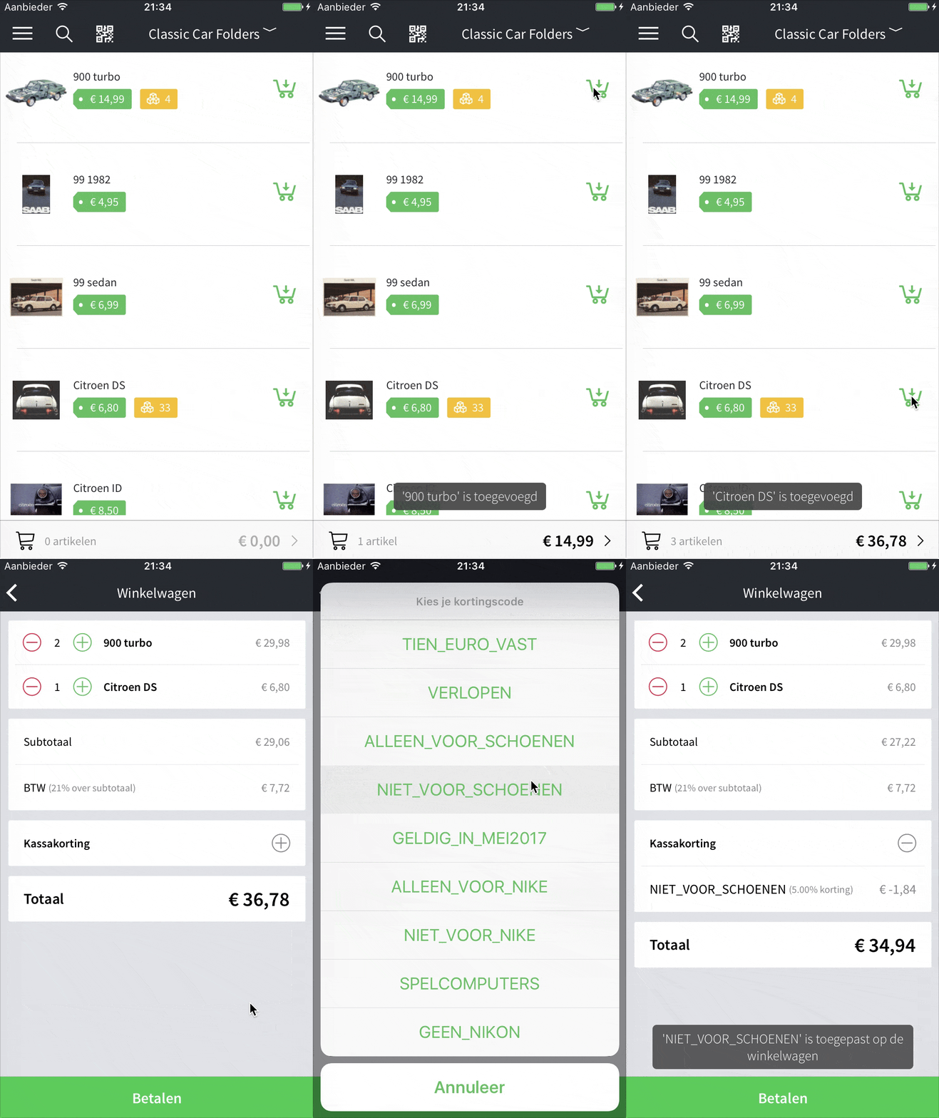
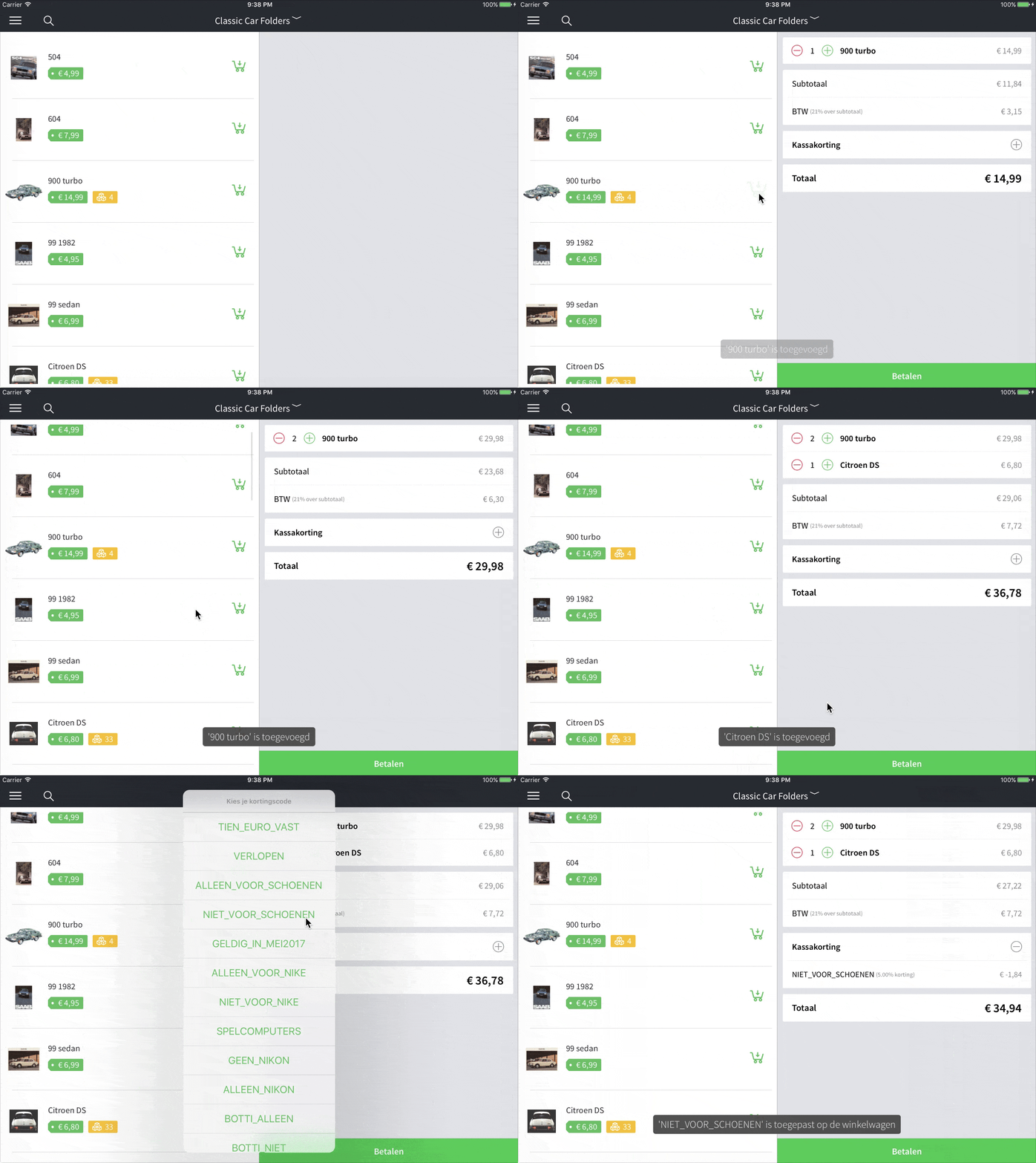
Let's first look at the end result to see what we're after. Below on the left we have a phone, on the right a tablet, both running the same POS (Point Of Sale) app.
The first page is an overview of all the products in your inventory, loaded in a ListView (with great performance!). The user (shop owner) can add a customer's articles to the shopping cart, and once done navigate to the cart and (for instance) apply a discount.
On phones we've added a little cart bar to the bottom of the article page, for tablets we wanted the cart to always be visible.
Excuse the Dutch 🇳🇱 text all over the place, we're currently i18n-ing the app, but that's not quite ready yet.
| iPhone 7 | iPad Pro 9,7 |
|---|---|
 |
 |
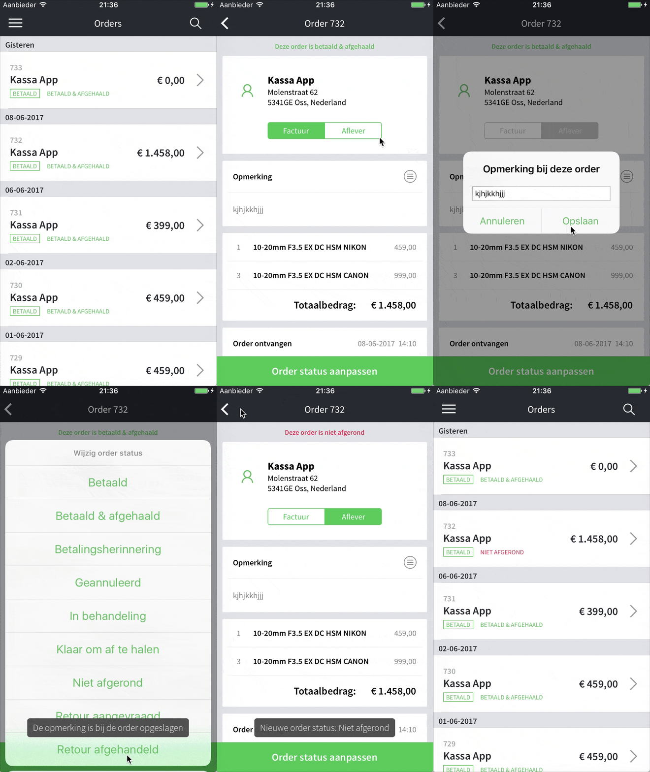
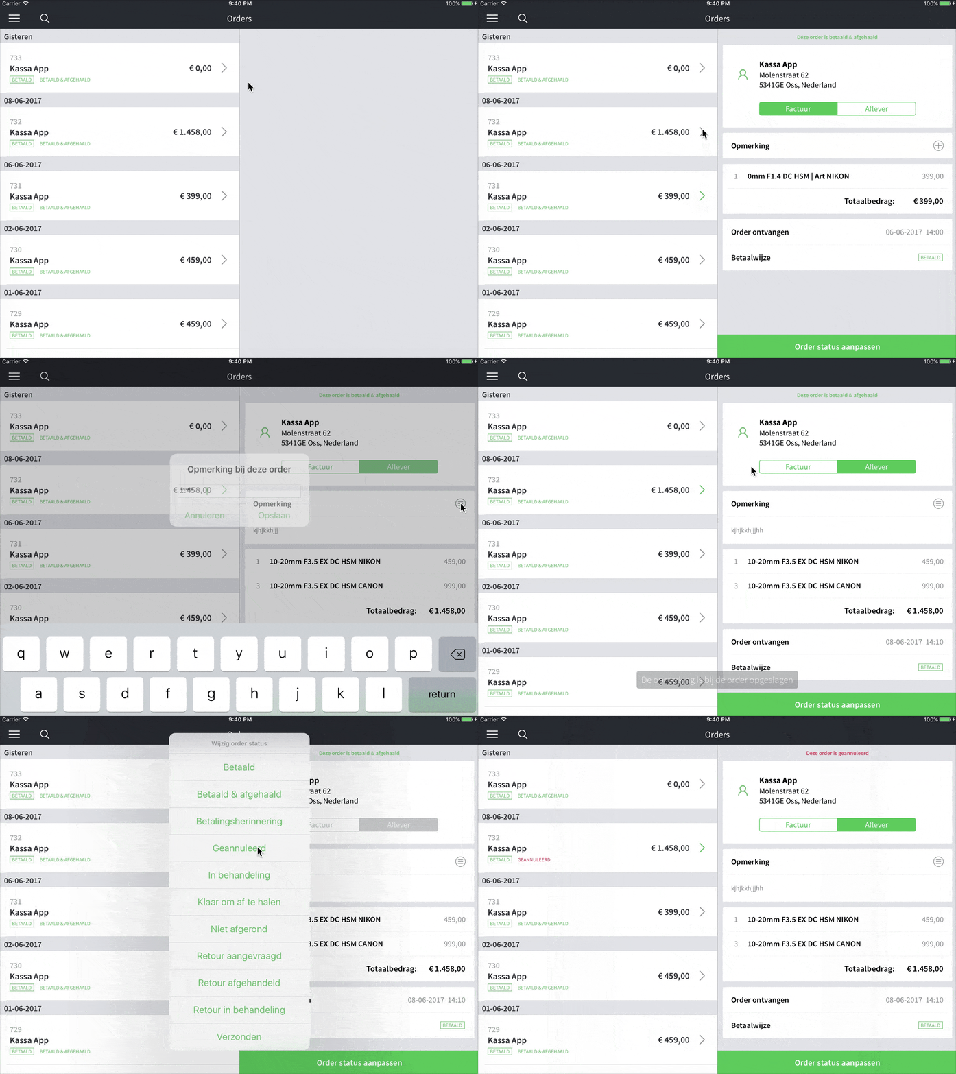
The split view example below is more of a traditional master-detail setup. On the first page we have orders that customers have previously created (either on the website or in the physical store, through this app), and upon selecting an order its details will be shown.
Note that on tablets we highlight the selected order slightly (the arrow changes color, it's perhaps too subtle), and when the order status changes (triggered by the big green button at the bottom) it's also reflected in the master list (text turns red).
 |
 |
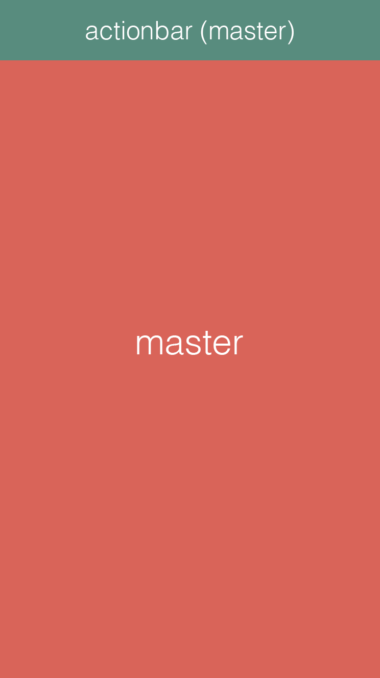
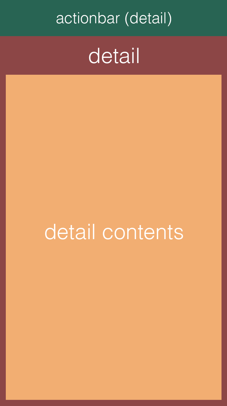
Those animations are pretty neat but a little epilepsy inducing 🤢, so but let's break them down into static images so we can scroll that noise out of our viewport and reason about this split view in a more relaxed manner:
| master | detail | master + detail contents |
|---|---|---|
 |
 |
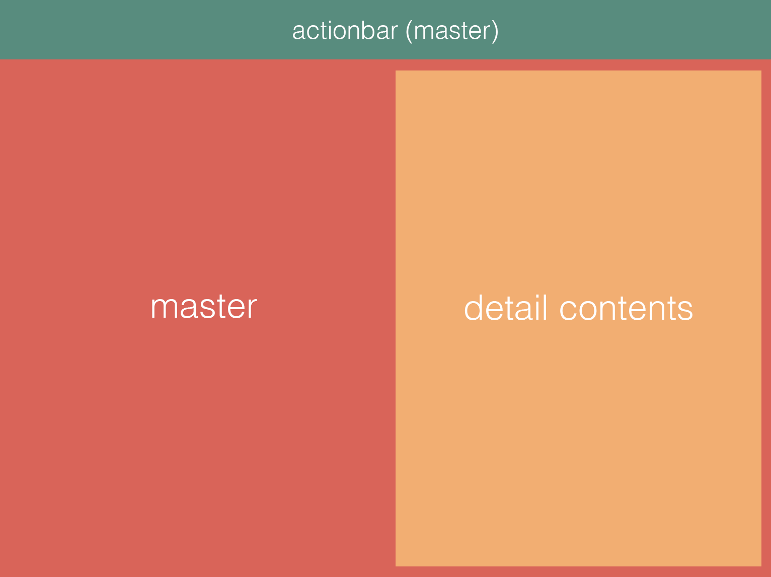 |
On a phone (the two images on the left) we have two physical views - labeled 'master' and 'detail'. The 'detail contents' area is a separate component that we've extracted so we can reuse it. On tablets we're only using the 'master' view, and we add the 'detail contents' component to the right.
To conditionally render a second column in the 'master' view we first need to know whether or not we're currently running on a tablet. Luckily NativeScript has got our backs on that one:
With that knowledge we can construct a view that supports both master-detail navigation on phones and split view on tablets:
So basically we're conditionally rendering a second GridLayout column on tablets where the contents can be shown, and we distribute the screen space evenly by using "*, *". You can play with this if the left pane would require a different width: "240, *" or "*, auto".
Upon selecting an item in the 'master' view your controller would add the selected item to some shared class that both the 'master' component and the 'detail-contents' component have access to (typically an Angular service class. And only on phones you would then navigate to the 'detail' view.
2. Custom styles
Tablets are typically used a bit further from the eye than phones so you may want to beef up things like font sizes. So let's take a look at how you would make a Label appear a bit bigger on tablets.
Remember we need to do this dynamically at runtime since we're building one binary only, so we can't just add an additional stylesheet to our build and be done with it.
2.1 App-wide styles
First, add a file 'app.tablet.css' next to your existing 'app.css'. Then copy over any style classes from app.css that you want to have appear differently on tablets. Note that app.css will still be applied first so this works just like in a browser where app.tablet.css is loaded after app.css, effectively overriding similar class definitions.
Now open "app.module.ts" and add this code to the constructor:
2.2 Component-specific styles
This is a bit harder since that browser-style override doesn't work for components. Add a file 'my-component.tablet.css' next to your existing 'my-component.css'. Then override any style in there by prefixing your tablet styles with ".tablet":
Now open "my-component.ts" and DO NOT add the file to your @Component styleUrls declaration as that would apply those tablet styles unconditionally.
So instead, we need to conditionally add the "tablet" class to the root of the page, so the ".tablet" prefix shown above is picked up, and load the tablet-specific css file:
While this all works great for my app and my usecases, I'm sure there are other clever ways to reuse application logic to support multiple device resolutions. For instance, if you need more granular control over when split views or styles are applied you could listen for screen rotation events and query the screen resolution at runtime.
As always, feel free to share your tips with the world in the comments!