Scaffold Your Next Mobile App with a NativeScript Template
We have some nice project templates to build your next {N} project with.
“There are more ways than one to skin a cat, so are there more ways than one of digging for money.”
- Seba Smith - The Money Diggers, 1840.

"There are more ways than one to dress a pug, so are there more ways than one of designing the app navigation”
- Sebastian Witalec - NativeScript blogs, 2017.

Choosing the right navigation model for your app is really important. Depending on the number of screens and their relationship you might either choose a tab navigation or a drawer navigation or even a combination of the two. However choosing what you want to do is just one side of the coin.
The other side of the coin is the actual implementation. The problem is that there are many different ways to:
- arrange your folder structure,
- organise the css styling mechanism,
- set up navigation process,
- and handle many other challenges.
After looking at some of the projects we've created with NativeScript over the years we realised that each developer had their own idea on how to dress their pug.
This is why we formed the Starter Kits Team. Who were tasked to come up with templates for NativeScript projects. They've spent some time researching various options and analysing common scenarios, weighing pros and cons of different techniques. As a result they've created a set of NativeScript project templates. Each project follows a consistent structure, each adheres to the industry best practices (like the Angular Style Guide) and each is a great place to start a brand new NativeScript project.
All you need to do is just run:
tns create app-name --template tns-template-name-herePlease note that this article is based on templates for
NativeScript 3.1, which are likely to evolve over time and some things might change. You cannot stop progress :)
The templates
The templates are divided into 3 categories:
- tab navigation
- drawer navigation
- master detail
Each of them comes in 3 variations:
- {N} Core with JavaScript
- {N} Core with TypeScript - with
-tssuffix - {N} Angular - with
-ngsuffix
Even though each template is quite different, they still have some things in common.
Styling
At the root of the project we have:
_app-variables.scss- holds the global SASS variables that are imported for each component's styles.app.scss- the global common style sheet. These style rules are applied to both Android and iOS.platform.android.scss- the global Android style sheet. These style rules are applied to Android only.platform.ios.scss- the global iOS style sheet. These style rules are applied to iOS only.
The _app-variables.scss style sheet is exactly the same for each template. This is the place where you can define the branding colours of your application. And if you need to build multiple apps using different templates, but the same branding colours, then you can just sync _app-variables.scss across all your projects.
Most UI elements use the $accent-dark and $accent-light variables, so this should probably be your stop number one to update the colour scheme of your apps.
Font Awesome
To add beautiful font based icons, each template comes with FontAwesome already configured.
All you need to do is to add an fa class to your component style and then provide the unicode value of the icon you want. For example, the following label will appear like this:
<Label class="fa h1" text="I like  more than "></Label>
As you probably can guess  is the bath tub and  is the shower.
Here is a cheatsheet of all Font Awesome icons
Tab Navigation
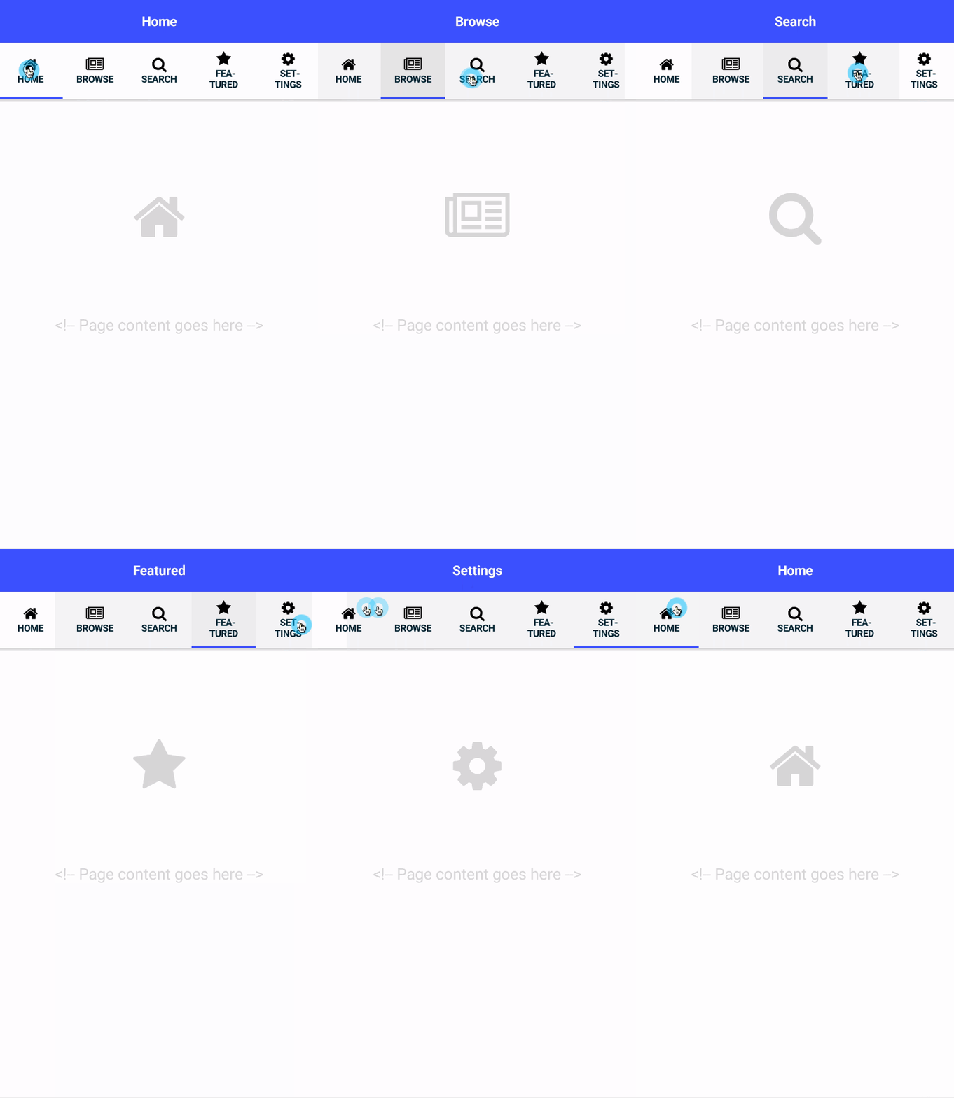
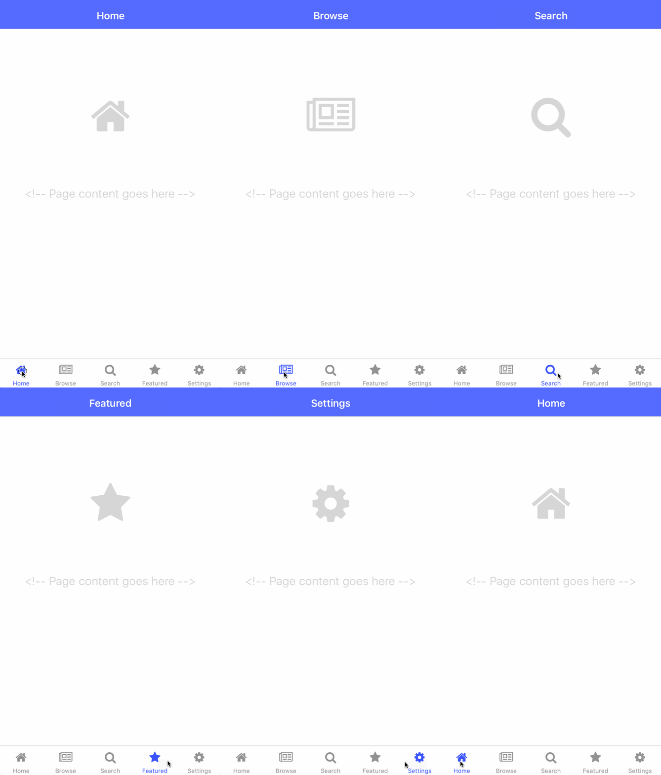
This is one of the simplest templates where each page is displayed in its own tab view. Out of the box we have 5 tabs: home, browse, search, featured and settings. Each tab is rather empty, but the templates are open for you to change them into something amazing.
How to create
To use the {N} Core JavaScript template, run:
tns create app-name --template tns-template-tab-navigation
To use the {N} Core TypeScript template, run:
tns create app-name --template tns-template-tab-navigation-ts
To use the Angular template, run:
tns create app-name --template tns-template-tab-navigation-ng
Make it your own
All of this template's magic is contained in the tabs folder, which contains the tabs page component and a folder for each of the tab views.
The list of available tabs is located in the tabs view file, depending on the project type it is either tabs-page.xml or tabs.component.html (Angular). Basically the tabs page contains a TabView component, which has a tab item for every page that we want to display.
To add content to any of the existing tab views, just go to their folder and make all your changes there.
To add a new tab, you need to create a new component in the tabs folder (just like the other ones) and then add a tab item to the TabView.
Github links:
Using custom UI Components with {N} Core
If you are using NativeScript Core then there might be one thing that you are not aware of yet, which is important in understanding what is going on in tabs-page.xml. That is how we to bring in external UI components. For example let's have a look at the Browse component. We know that it is located in the /tab/browse folder and the file containing the component is called BrowseView. So to add to it tabs-view we need to:
-
Add a reference to
<Page>in the formatxmlns:namespace="folderurl"
xmlns:browse="/tabs/browse" -
Add the component in the format
<namespace:filename />
<browse:BrowseView />
Drawer Navigation
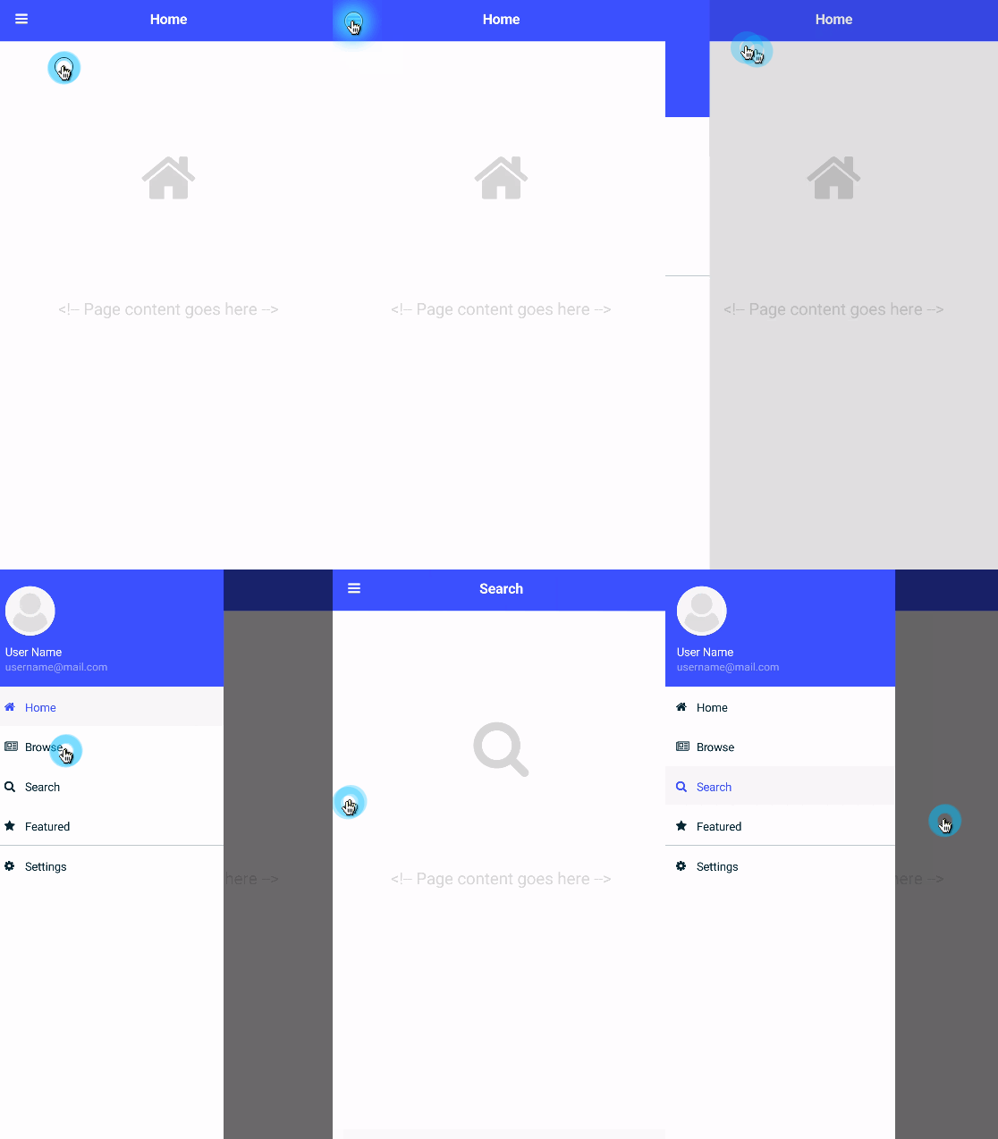
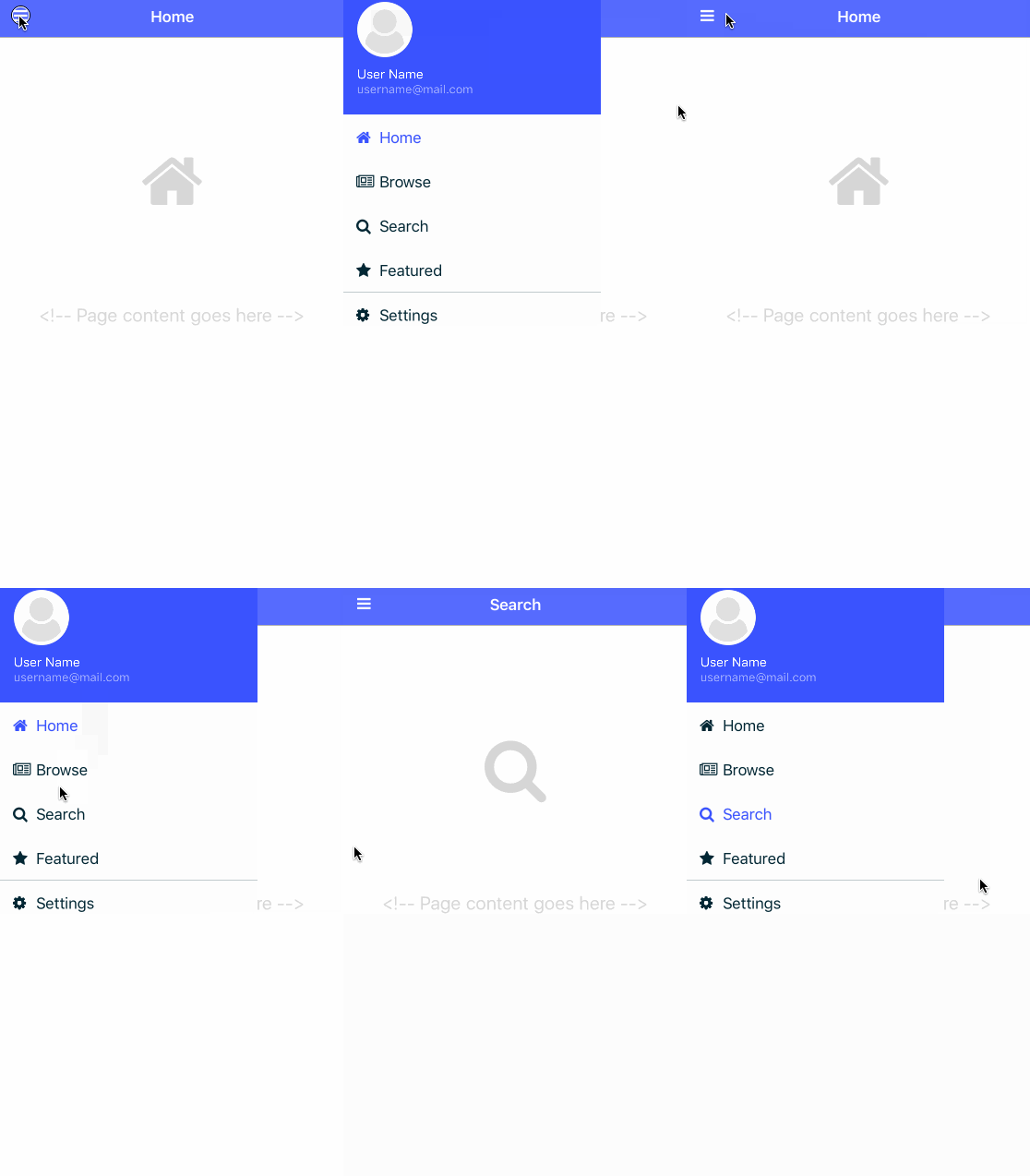
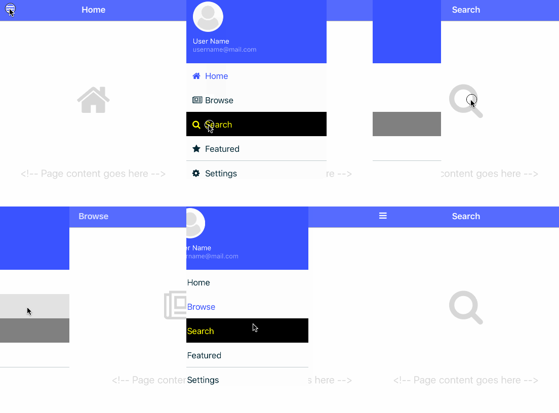
The drawer template uses a side drawer for navigation. You can bring in the side drawer by either pressing the hamburger icon (in the top left corner) or by dragging the screen from left edge to right.
Just like with the tabs template, we have 5 pages we can navigate to: home, browse, search, featured and settings.
How to create
To use the {N} Core JavaScript template, run:
tns create app-name --template tns-template-drawer-navigation
To use the {N} Core TypeScript template, run:
tns create app-name --template tns-template-drawer-navigation-ts
To use the Angular template, run:
tns create app-name --template tns-template-drawer-navigation-ng
Make it your own - {N} Core
To add a new page to the navigation just go to shared/my-drawer/MyDrawer-view-model. The view model contains an array of navigation items, each is made of the following fields:
- title - the text that goes into the drawer
- icon - the icon that goes next to the title - this is using FontAwesome icons
- name - navigation item specific css class - more on the topic below
- route - the location of the page this item should navigate to
- isSelected - an expression to check if the current item is the same as the current page
Here is an example:
{
  title: "Featured",
  name: "featured",
  route: "featured/featured-page",
  icon: "\uf005",
  isSelected: selectedPage === "Featured"
},
Make it your own - {N} Angular
To add a new page to the navigation just go to shared/my-drawer/my-drawer.component. The component contains an array of navigation items, each is made of the following fields:
- title - the text that goes into the drawer
- icon - the icon that goes next to the title - this is using FontAwesome icons
- name - navigation item specific css class - just add a css class to
app.scssthat matches the style you want to use - route - the navigation path as defined in
app-routing.module.ts
Here is an example:
{
  title: "Featured",
  name: "featured",
  route: "/featured",
  icon: "\uf005"
},
NavigationItem specific styling
By default all items in the side bar are made to look the same, but the template provides a neat mechanism to style each item.
All starts with the name property you provided in ItemTemplate:
{
  title: "ABC",
  name: "abc",
  ...
}
We can take abc and add additional classes to our css, that will only apply to abc:
- default -
sidedrawer-list-item-abc, - when selected -
sidedrawer-list-item-abc selected
To use it, you just need to add the additional styling to .sidedrawer-list-item class in the drawer's css file - either _MyDrawer.scss (Core) or _my-drawer.component.scss (Angular).
.sidedrawer-list-item {
  // current css
...

  .sidedrawer-list-item-abc {
    background-color: black;
    Label {
      color: yellow;
    }

    &.selected {
    background-color: gray;
      Label {
        color: red;
      }
    }
  }
}
This is what you should see as the result:
Github links:
Master Detail
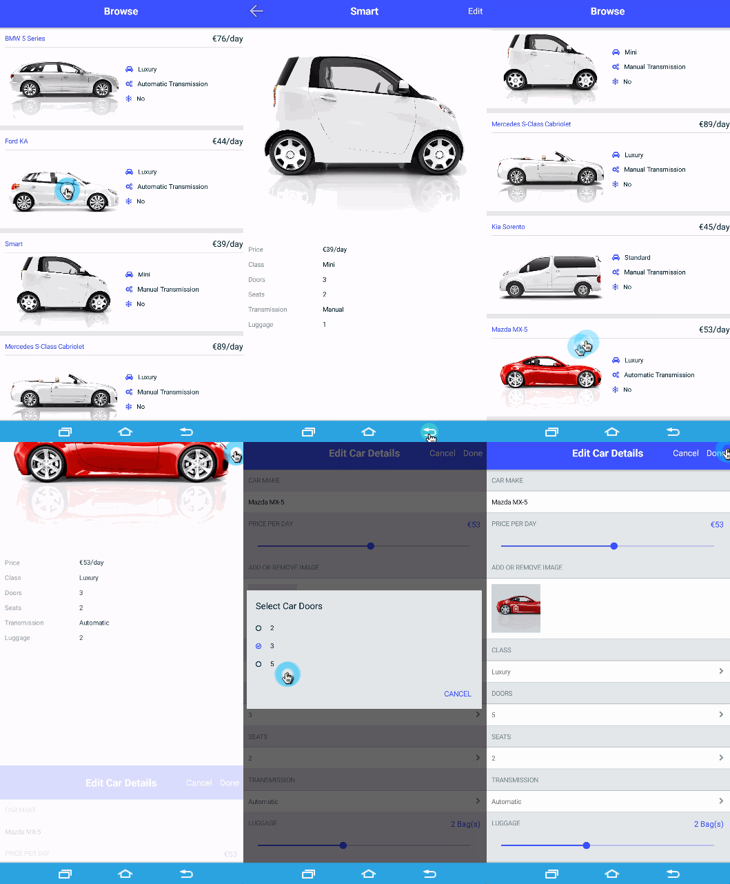
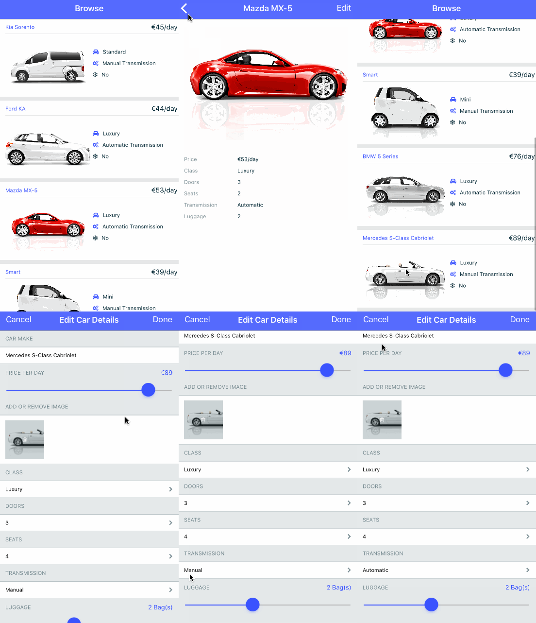
The final template is focused on a Master Detail navigation. Where the Master page loads a list of cars from Firebase or Kinvey. When you tap on any of the items the app navigates to the car-detail page.
This template works offline. Which is often a must have requirement for a serious app.
How to create
To use the {N} Core JavaScript template, run:
tns create app-name --template tns-template-master-detail
To use the {N} Core TypeScript template, run:
tns create app-name --template tns-template-master-detail-ts
To use the Angular template, run:
tns create app-name --template tns-template-master-detail-ng
Getting your head around it
There are 3 major components that are worth having a look at:
car-listin thecarsfolder - it is used to display all cars in a list viewcar-detailin thecars/car-detailfolder - it is used to display a detailed view for a selected carcar-detail-editin thecars/car-detail-editfolder - it is used to edit a selected car
Additionally there are 2 helper components that are used to edit car details:
list-selector- a smart drop down like UI component, which displays the currently selected value and when you tap on it, it opens a modal window letting you choose another option,image-add-remove- this component allows you to select a different image from your image galery
Finally we also have a car-service (in the cars/shared folder), which is the service responsible for loading the data from the backend and sending updates.
Github links:
template-master-detail-kinvey-ng
Work in progress
Please note that this is still a work in progress and we would like to hear any feedback you have to share with us. The best thing to do is to create a github issue under the relevant project. We already had a few, which helped us make the templates better.
Summary
These templates are a really easy way to get you on the way to build world class apps. Whether you are a seasoned {N} dev or new to it, the templates offer a lot of smart solutions and best practices. Plus you get a nicely styled app with consistent look and feel between Android and iOS out of the box.
So ...

Give them a go and build world class apps.