NativeScript Angular - Performance Tips & Tricks
Learn useful tips and tricks to optimize your Angular NativeScript apps
Overview
- Performance Challenges
- Analyzing Your Application - iOS
- Optimizing Your Views
- Hacks, Limitations and Future Roadmap
Objective:
Deliberate Design: Architecting your application correctly can have a significant impact on navigation time, on-page render performance and application maintenance.
Performance Challenges
Web Mentality in Native Applications Does Not Work
Coming from a web development background, you may be confused to find so many different layout types at your disposal: StackLayout, GridLayout, AbsoluteLayout, etc. The world has gotten much more complex than a simple div and styling for positioning.
This is where your initial tendency may get you into trouble in your application’s architecture. Let’s take an example UI implementation to help elaborate on this.
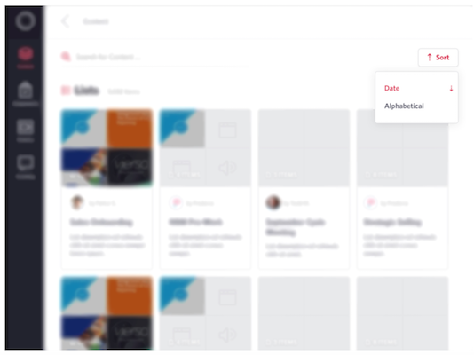
Scenario: You’ve been tasked to build a simple dropdown element. The dropdown is not a native control, as you have styling restrictions that cannot be accomplished inside the iOS or Android pickers.
Example Design Mock

After reading through the NativeScript docs, you may decide a StackLayout could best suit the stacking label design with the custom icon on the right side. To encompass the outer dropdown component, you will certainly need a container to set width, height, and a border. Let’s assume you mock up some code similar to this:
<StackLayout borderColor="#D6D6E4" borderWidth="1" borderRadius="5" backgroundColor="white">
   <StackLayout orientation="horizontal">
       <Label class="accent" text="Date"></Label>
       <!-- Custom Icon Directive -->
       <Label horizontalAlignment="right" icon="sort"></Label>
   </StackLayout>
   <StackLayout orientation="horizontal">
       <Label text="Alphabetical"></Label>
   </StackLayout>
</StackLayout>
There is a layout to consume the outer styling, a layout to encompass each row and so-forth. This is where as a developer you start down a slippery slope. When this code renders natively you create 3 view containers. What is 3 containers in the bigger picture? Just for this drop down component alone, we introduce the following complexity on the applications rendering.
VC = N + 1
VC = view containers
N = number of options
NativeScript is Single Threaded: Did you know that all the UI and interactions are ran on the main UI thread? This means you are taxing your application for each container it has to render. The number of containers also affect the performance of the underlying native frameworks and their rendering and layout times.
Note: NativeScript does allow you to use background workers, but these are not meant for UI and are instead used for services such as http calls, large data manipulations, etc.
How do we overcome this challenge? We will cover that in a few sections, but first let’s analyze your current application to see if you are falling victim to this approach.
Analyzing Your Application - iOS
Prerequisite: You will need to have Xcode installed on your machine.
Run your application either through the command line or through Xcode directly. If you run the application from the command line, you will need to attach the Xcode debugger to your app. After the application has bootstrapped and rendered on your emulator, navigate to a specific page to take a snapshot.
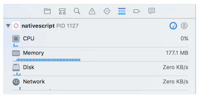
Select your application and go to the “Debug Navigator”:

In the bottom-center of the screen, you will need to select the “Debug View Hierarchy” (the icon looks like 3 boxes):

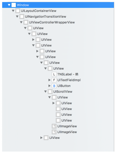
Xcode will take a snapshot and allow you to view the hierarchy of containers on your native application. In our example application (which has already been quite optimized), we have the following snapshot:

Take into consideration that your application has to re-render many of these views, every time you navigate to or from a route. If you are noticing navigation lag on a device, too many views is most likely your culprit.
How many views is appropriate for your application? That depends. Just in iOS devices, the amount of allocated RAM varies from the Air 1 to the Air 2. Newer devices like the iPad Pro can render a poorly optimized application, although requiring higher CPU usage and memory consumption.
As a best practice you should attempt to accomplish your UI by the following two principles:
- Native UI where possible (even plugins ported to NativeScript most likely use more concise view layouts).
- As few views as possible to accomplish your UI. This means thinking outside of the documentation and current available examples.
Optimizing Your Views
Using our seed, we share code to accomplish a web and native application. We have several dozen shared components; from dropdowns, to card layouts, button controls, navigation bars, etc.
Attribute Selectors vs. Element Selectors
Using the Angular CLI, our components are generated in element-syntax. This is the first optimization you can leverage that can improve both web and native performance. The component decorator allow you specify a selector:
@Component({
   moduleId: module.id,
   selector: 'dropdown, [dropdown]', // notice [dropdown]!
   templateUrl: './dropdown.component.html',
   styleUrls: ['./dropdown.component.scss']
})
Now your component can attach itself to a parent container and simplify the complexity of the micro-component.
Before Optimizations
<GridLayout>
   <StackLayout>
       <dropdown></dropdown>
   </StackLayout>
</GridLayout>
After Optimizations
<GridLayout>
   <StackLayout borderWidth=”1” borderColor=”#D6D6E4” dropdown></StackLayout>
</GridLayout>
But wait - couldn’t we have just not placed the StackLayout in our parent view… what purpose did that serve?
The example view is simplified, and there is an assumption that other UI would be either above or below the drop down. With the before version, we have no styling control over our micro-component, in terms of how it is rendered in respect to the parent view. Take into consideration a more complex view:
<GridLayout rows="160, 40, *">
   <banner></banner>
   <StackLayout row="1">
       <dropdown></dropdown>
   </StackLayout>
   <StackLayout row="2"
       <card-table></card-table>
   </StackLayout>
</GridLayout>
In order to accomplish removing the two StackLayout complexity, we would have to have inputs on our micro-components to accept the row property; to allow the micro component to intelligently handle which row of the GridLayout it will render on. By default, your custom components do not know how to handle the styling properties of native layouts and render on row 0 and column 0.
Not only is the attribute a cleaner approach, it’s also a more readable technique for developers to understand what your component is doing.
Side Note: In our application, our team leverages both techniques of attribute-selectors and binding to NativeScript properties, as some views are just too complex or re-usable to handle otherwise.
GridLayout is King
The GridLayout is the best of all worlds. It allows you to render UI on different rows, columns and of varying sizing properties. In many cases, you can actually skip using a StackLayout altogether. Referring back to our dropdown example, we can completely recreate the view using a single view container and a little magic with ng-template.
Full Example
<GridLayout verticalAlignment="top"
   rows="auto"
   [width]="width"
   padding="20"
   horizontalAlignment="right"
   borderColor="#D6D6E4"
   borderWidth="1"
   borderRadius="5"
   backgroundColor="white"
   [margin]="margin">
   <ng-template ngFor let-option [ngForOf]="options" let-i="index">
       <Label [class.accent]="option.selected" (tap)="toggleSort($event, option)"
           [row]="i"
           [marginTop]="i * 35"
           class="semi-bold"
           verticalAlignment="top"
           [text]="option.label | translate"></Label>
       <Label *ngIf="option.selected"
           [row]="i"
           [marginTop]="i * 35"
           icon="sort"
           verticalAlignment="top"
           horizontalAlignment="right"
           class="accent"
           (tap)="toggleSort($event, option)"
           [rotate]="sortDir === 'desc' ? 180 : 0"></Label>
   </ng-template>
</GridLayout>
That’s a lot to take in, so let’s call out a few things we are doing.
- Leveraging a GridLayout for the outer container, allowing our rows to auto-size to their contents.
- Using an ng-template to avoid another view container and to get access to the index of the “options” repeater.
- Dynamically binding the row of each Label to be its index position.
- “Faking” stacking by using a marginTop calculation to push the Label down.
Our view container complexity equation is now:
VC = 1
VC = view container
This means that regardless of the number of options, we will never have an additional view container to render. You do have to render the Label, but that is a minor performance hit that you already had to account for.
Best Practices, Limitations and Future Roadmap
Best Practices
In our own search of getting better performance out of our app, we came across a variety of useful tips, tricks, and requirements for getting the most out of your NativeScript Angular app.
- You have to use Webpack, AOT and Uglify
- For Android leverage the additional "Snapshot" step that further boosts the loading time and runtime performance.
- Lazy-Load modules where possible
- Wrap complex views in *ngIf to delay execution of rendering
- Pre-load lazy-loaded modules in the background
- Reduce view complexity
Webpack, AOT and Uglify
If you are not familiar with the performance benefits of webpack, AOT and uglify; than you will first notice the size reduction in your app bundle. In our own application, we went from 50+mb to around 35mb.
Outside of the size reduction, your application will bootstrap faster - eliminating a lot of the “white screen” effects you may be experiencing.
Lazy Loaded Modules
By breaking up your modules, they will be built into separate “chunks”. This means your application will only request that chunk when it actually needs it. This avoids a lot of overhead with fetching more information than your application needs per view.
Wrapping Complex Views
This technique I need to credit to Eddy on this git issue. By delaying the rendering of complex views, it allows your navigation event to complete soon on the main thread, giving your user the illusion that the app isn’t lagging. You can adjust the threshold of the timeout, depending on how intensive your view is.
Component Class
renderView = false;
renderViewTimeout: any;

ngAfterContentInit() {
   this.renderViewTimeout = setTimeout(() => {
       this.renderView = true;
   }, 300);
}
ngOnDestroy() {
   clearTimeout(this.renderViewTimeout);
}
Preload Lazy Loaded Modules
Also credit to Eddy, this modification allows your app to background fetch all the lazy-loaded modules registered to a specific routing module. In our own application we did not notice a huge performance improvement, but it is worthy of mentioning.
App Router Module (app-routing.module.ts)
NativeScriptRouterModule.forRoot(
   <any>APP_ROUTES, { preloadingStrategy: PreloadAllModules })
Reduce View Complexity
Some designs just do not make sense for a native application, especially a NativeScript application. NativeScript is prestigious for its ability to access native APIs - not rendering complex UI. Move large views to use segmented views or tabbed views and push back on designs that are container heavy.
If you’re an experienced native developer or have access to one, you can also create the component natively and port them into NativeScript.
Limitations
A blank NativeScript Angular project bootstraps at ~100mb of memory consumption. While each release cycle on NativeScript brings huge improvements over the last, it would be great to see a lower overhead on a new project.
As a rule of thumb, your application should not consume more than 45% of the allocated memory of the device. Out of the gate, with NativeScript consuming 100mb, they are only leaving you 360.8 mb to work with for devices older than the Air 2. That means 20% of your memory allocation is just because you are using NativeScript with the JavaScript Core engine.
There are modifications you can make, such as using WebPack & AOT to reduce this down to around 90mb, but still this seems high for rendering a blank view.
Future Roadmap
At the time of this article, NativeScript will be releasing 3.2 at the end of the month. This release includes view recycling as well as a patch to the memory leak introduced in tns-ios 3.0. Both of these changes pave the way for better performance in your application.
Good luck and feel free to comment below or reach out to me in the NativeScript forums, Slack community, or Github.