NativeScript Blog
Demystifying NativeScript Layouts
Jen Looper
July 14, 2015
Learn about layouts in NativeScript and create great cross-platform UIs using a combination of XML markup and JavaScript.
Telerik's open-source NativeScript framework offers a new way to build mobile apps that lets you write JavaScript or TypeScript, XML markup, and CSS to create truly native cross-platform experiences for your app users. If you're ready to dive in and start building an app, the first step is to understand how the pieces fit together by watching the Getting Started videos or poring through the docs. You could also read how NativeScript works. Next, you should get your development environment set up and ready to go. Once you're set up and you have a wireframe sketched out... it's time to start building!
If you're coming from a hybrid mobile background in terms of building mobile apps, you may be used to building mobile apps in a similar style to the way you would design a web app. If your app includes more than simple lists and widgets, you need to lay out elements on the screen so that everything will fit and scale well on all the various sized screens on which your users might view your app.
To do this, you might turn to a grid like pure.css or the very lightweight skeleton for a responsive grid so that you can start placing your content on a screen. These grids and layout helpers, however, only work for hybrid mobile apps which rely on the DOM to place elements on a screen. In a NativeScript-built app, however, you do not have access to the DOM and screen flow of the Cordova-powered hybrid mobile app. By understanding how layouts work in NativeScript, however, you will still be able to quickly craft an effective UI for your mobile app. So let's get started!
The same layout could be created in a code-behind file:
As you can see, elements are added to the layout as its children, and are given attributes progressively.
We are presented with a simple stack of content elements:
Stacked horizontally with
Adding horizontalAlignment to the layout aligns the entire block of content:
Combining horizontalAlignment and verticalAlignment constrains the proportions of the content, an effect that can be further controlled by setting minWidth or minHeight:
More control over the way the child content is handled is available to you by working with horizontalAlignment, verticalAlignment, and minHeight or minWidth in the layout's child elements (note that by default the content is stretched and the default value of horizontalAlignment and verticalAlignment is 'stretch'):
As you start working with layouts, you'll find that their behavior is heavily dependent on the attributes of their children. It's important to understand the way layouts handle the rendering of their child elements and the attributes that the child elements have available to handle their appearance within a layout. When working with widgets such as the
Without much styling or alignment, this group of labels looks like this:
 Setting the same grid to have 'star' rows and columns stretches the children to the height of the grid cell and the width of the content :

Changing the
And adding a fixed value to the grid cells and a
This produces:
So on iOS, the files will look like this:
To stop this pixellation and control the look of your images on your device, you can set their
You end up with a set of images that preserve their aspect ratio:
 The
The
In this situation, we might be tempted to create a complex nested layout, since:
That layout in a tabbed interface produces this screen:
Understanding the various properties of UI widgets can help you understand how they'll act in a GridLayout. For example, in this app:
Seems complicated? It can be a little, but once you understand the way each type of layout works with regards to how it handles its children and scales its child content, you will be able to create terrific-looking apps. This app, for example, looks nice on an iPad, iPhone, and Android device:
I encourage you to look at various NativeScript examples to understand how layouts can vary from simple to quite complex. Once you understand how they work, you'll be able to create really nice user experiences for your customers! With thanks to Hristo Hristov and TJ VanToll for help on this article
If you're coming from a hybrid mobile background in terms of building mobile apps, you may be used to building mobile apps in a similar style to the way you would design a web app. If your app includes more than simple lists and widgets, you need to lay out elements on the screen so that everything will fit and scale well on all the various sized screens on which your users might view your app.
To do this, you might turn to a grid like pure.css or the very lightweight skeleton for a responsive grid so that you can start placing your content on a screen. These grids and layout helpers, however, only work for hybrid mobile apps which rely on the DOM to place elements on a screen. In a NativeScript-built app, however, you do not have access to the DOM and screen flow of the Cordova-powered hybrid mobile app. By understanding how layouts work in NativeScript, however, you will still be able to quickly craft an effective UI for your mobile app. So let's get started!
The Basics of Building Layouts
Layouts in NativeScript can be created either by writing XML markup to create a UI, or using JavaScript to add elements to a dynamically-created UI behind the scenes. For example, the following is a two-column grid layout via XML:<GridLayout columns="auto,auto" rows="auto">
<Label col="0" text="hello"/>
<Button col="1" text="ohai"/>
</GridLayout>
var layout = require("ui/layouts/grid-layout");
var buttonModule = require("ui/button");
var labelModule = require("ui/label");
exports.loaded = function(args) {
var page = args.object;
var gridLayout = new layout.GridLayout();
var button1 = new buttonModule.Button();
var label1 = new labelModule.Label();
button1.text = "hello";
label1.text = "ohai";
layout.GridLayout.setColumn(button1, 0);
layout.GridLayout.setColumn(label1, 1);
gridLayout.addChild(button1);
gridLayout.addChild(label1);
var firstColumn = new layout.ItemSpec(1, layout.GridUnitType.auto);
var secondColumn = new layout.ItemSpec(1, layout.GridUnitType.auto);
var firstRow = new layout.ItemSpec(1, layout.GridUnitType.auto);
gridLayout.addColumn(firstColumn);
gridLayout.addColumn(secondColumn);
gridLayout.addRow(firstRow);
page.content = gridLayout;
};
As you can see, elements are added to the layout as its children, and are given attributes progressively.
ItemSpec is a class that specifies the value and type of the row height and the column width. It's up to you how you choose to code your layouts - using XML can be a little shorter and easier but either way is fine.Types of Layouts
NativeScript layouts come in five 'flavors', described here. NativeScript technical lead, Alexander Vakrilov, explains NativeScript layouts this way:"The basic concept is that we have different layout views (or layout containers) which can have one or more child views. Each layout container has its own logic of how it arranges its children inside the space it is given."Below is a list of the types of layouts and their flow:
- Absolute Layout: Position elements by a child's x and y coordinates. You might use absolute layouts to show an activity indicator widget in the top left corner of your app.
- Dock Layout: Dock layouts are useful if you need to place elements in very specific areas of your app. For example, a container docked at the bottom of the screen would be a good container for an ad.
- Grid Layout: Look at grid layouts as the
<tr>and<td>tags of NativeScript. Create a grid and add children to it withrowSpansandcolSpans, similar to HTML markup for tables. - Stack Layout: Stack children of this layout either vertically or horizontally.
- Wrap Layout: Children of this layout will flow from one row or column to the next when space is filled.
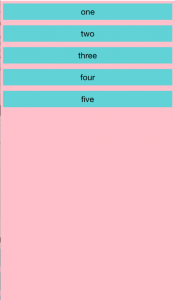
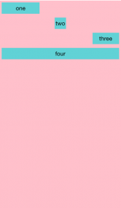
StackLayout to layer one item after another vertically. The markup would be simple to do this:
<StackLayout orientation="vertical">
<Button text="one"/>
<Button text="two"/>
<Button text="three"/>
<Button text="four"/>
<Button text="five"/>
</StackLayout>

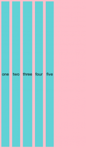
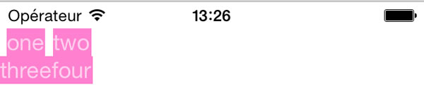
Stacked horizontally with
orientation="horizontal", the same markup would simply align horizontally:
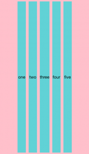
Adding horizontalAlignment to the layout aligns the entire block of content:
<StackLayout orientation="horizontal" horizontalAlignment="center">

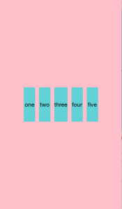
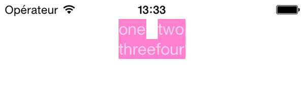
Combining horizontalAlignment and verticalAlignment constrains the proportions of the content, an effect that can be further controlled by setting minWidth or minHeight:
<StackLayout orientation="horizontal" horizontalAlignment="center" verticalAlignment="center" minHeight="100">

More control over the way the child content is handled is available to you by working with horizontalAlignment, verticalAlignment, and minHeight or minWidth in the layout's child elements (note that by default the content is stretched and the default value of horizontalAlignment and verticalAlignment is 'stretch'):
<StackLayout orientation="vertical">
<Button text="one" horizontalAlignment="left" minWidth="100"/>
<Button text="two" horizontalAlignment="center" minWidth="30"/>
<Button text="three" horizontalAlignment="right" minWidth="70"/>
<Button text="four"/>
</StackLayout>

As you start working with layouts, you'll find that their behavior is heavily dependent on the attributes of their children. It's important to understand the way layouts handle the rendering of their child elements and the attributes that the child elements have available to handle their appearance within a layout. When working with widgets such as the
ListView, for example, make sure to set the parent grid to have "star" height or it will be truncated. When working with images, on the other hand, you can set the image itself to fit into its available space by setting its stretch property as noted below.
Stretching Content and Grid Layouts
What about when you need to arrange your content into a grid? Using a GridLayout, you have control over the widths and heights of the grid cells and how the content in the cell will be presented. When setting up the grid, you can specify how each row and column will handle its child content:- auto – the row or column takes on the dimensions of its child.
- pixel – a numeric value specifies the size of the cell in device independent pixels.
- star – value specifies the relative value against other stars.
Note: By default, GridLayout behaves as a single row and single column with 'star' height and width. You'll need to plan your use of this kind of layout with widget control children accordingly.
<GridLayout rows="auto,auto" columns="auto,auto">
<Label text="one" row="0" col="0"/>
<Label text="two" row="0" col="1"/>
<Label text="three" row="1" col="0"/>
<Label text="four" row="1" col="1"/>
</GridLayout>
Setting the same grid to have 'star' rows and columns stretches the children to the height of the grid cell and the width of the content :
Changing the
horizontalAlignment attribute gives a little better look to the grid:
<GridLayout rows="auto,auto" columns="auto,auto" horizontalAlignment="center">
<Label text="one" row="0" col="0" horizontalAlignment="left"/>
<Label text="two" row="0" col="1" horizontalAlignment="right"/>
<Label text="three" row="1" col="0" horizontalAlignment="left"/>
<Label text="four" row="1" col="1" horizontalAlignment="right"/>
</GridLayout>
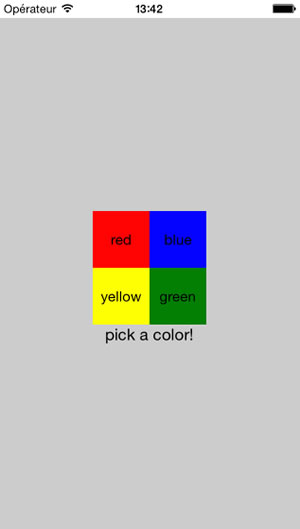
And adding a fixed value to the grid cells and a
colSpan to span the bottom of the grid gives you more fine-grained control over your content:
<GridLayout rows="60,60,auto" columns="60,60" horizontalAlignment="center" verticalAlignment="center">
<Button text="red" row="0" col="0" cssClass="red"/>
<Button text="blue" row="0" col="1" cssClass="blue"/>
<Button text="yellow" row="1" col="0" cssClass="yellow"/>
<Button text="green" row="1" col="1" cssClass="green"/>
<Label text="pick a color!" row="2" colSpan="2" horizontalAlignment="center"/>
</GridLayout>
Layouts with Images
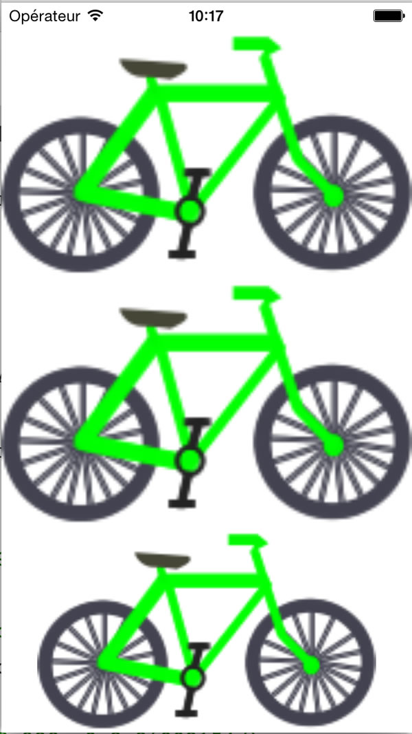
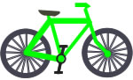
Making images look great in a NativeScript layout is related to how the framework handles content scaling. NativeScript does a great job at scaling image content. As is typical of a native app, the developer is expected to create several versions of each image, named with the naming convention that delineates its size. For iOS, create a 1x, 2x, and 3x, version of your file, named according to their size and place them in the App_Resources/iOS folder. For Android, create three versions of your file without any special naming convention, and sort them into the proper folder in App_Resources/Android. The smallest file will go into drawable_ldpi, and the biggest will go into drawable_hdpi (you can create even more high-resolution images, just store them in the properly-named Android folders).So on iOS, the files will look like this:
bike.png
[email protected] (twice the size of bike.png)
[email protected] (three times the size of bike.png to support Retina displays)

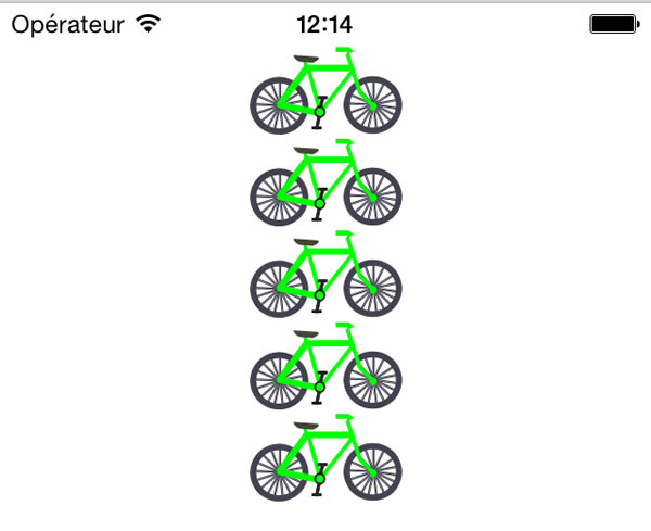
To stop this pixellation and control the look of your images on your device, you can set their
stretch attribute:
<StackLayout orientation="vertical" horizontalAlignment="center">
<Image src="res://bike" stretch="none"/>
<Image src="res://bike" stretch="none"/>
<Image src="res://bike" stretch="none"/>
<Image src="res://bike" stretch="none"/>
<Image src="res://bike" stretch="none"/>
</StackLayout>
The stretch attribute of images can be one of four values:
- None - The image preserves its original size.
- AspectFill - The image is resized to fill in the destination dimensions while it preserves its native aspect ratio.
- AspectFit - The image is resized to fit the destination dimensions while it preserves its native aspect ratio. If the aspect ratio of the destination rectangle differs from the image, the image is clipped to fit in the destination.
- Fill - The image is resized to fill the destination dimensions and the aspect ratio is not preserved.
Complex Layouts
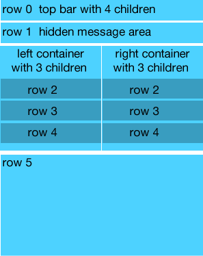
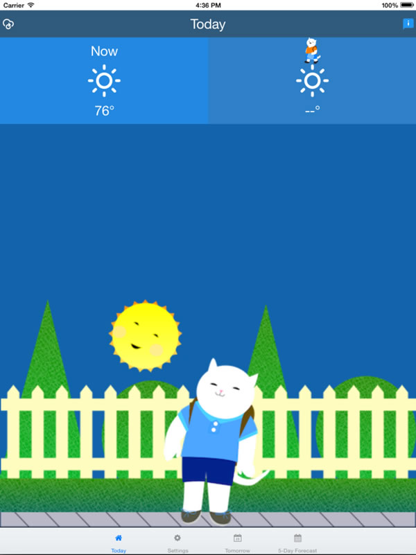
Perhaps you need a layout that supports content scaling for images and the possibility of stretching blocks of color to fill up a screen of any size. A weather app that I am building, for example, calls for a complex layout such as this:
In this situation, we might be tempted to create a complex nested layout, since:
- We have a top navigation bar.
- There is a hidden message area that appears if there is an error or a problem getting data from forecast.io (the weather service API)
- We have two colored boxes at the top that need to scale to an iPad (as this is a kids' app) and content below that needs to span the columns at the top.
- Within the two top boxes and across the bottom area are images that must be scaled but not stretched.
<GridLayout columns="*,*,*,*" rows="auto, *, *">
<!--This area is the top header bar-->
<GridLayout class="header-container" colSpan="5" columns="*,*,*,*,*">
<Label text="" horizontalAlignment="left" verticalAlignment="center" tap="refresh" class="top-icon weather-icon small-icon"/>
<Label text="My Weather" colSpan="5" horizontalAlignment="center" verticalAlignment="center" class="large-text"/>
<ActivityIndicator col="3" busy="{{ isLoading }}" horizontalAlignment="right" />
<Label text="" col="4" horizontalAlignment="right" verticalAlignment="center" class="top-icon weather-icon small-icon" tap="openInfo"/>
</GridLayout>
<!--The weather information container, two grid-based columns with a stacked layout in each one-->
<StackLayout class="blue1-container" colSpan="2" row="1">
<Label text="Now" row="2" colSpan="2" horizontalAlignment="center" verticalAlignment="center" class="large-text top"/>
<Label row="3" horizontalAlignment="center" colSpan="2" text="" class="weather-icon large-icon"/>
<Label text="77°" row="4" colSpan="2" horizontalAlignment="center" class="large-text" />
</StackLayout>
<StackLayout class="blue3-container" colSpan="2" row="1" col="2">
<Image stretch="none" row="2" col="2" colSpan="2" src="res://bike" horizontalAlignment="center" class="top" verticalAlignment="center" />
<Label row="3" horizontalAlignment="center" colSpan="2" text="" class="weather-icon large-icon"/>
<Label text="77°" row="4" col="2" colSpan="2" horizontalAlignment="center" class="large-text" />
</StackLayout>
<!--The bottom area where we show what to wear based on the weather forecast for the student's chosen departure time-->
<Image stretch="aspectFit" row="2" colSpan="4" src="res://warmbg" verticalAlignment="bottom" />
</GridLayout>
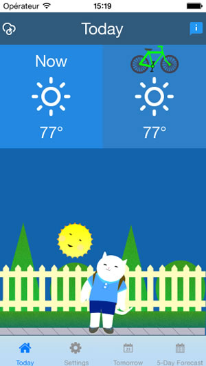
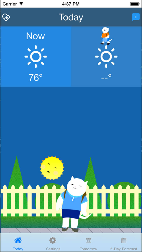
That layout in a tabbed interface produces this screen:
Understanding the various properties of UI widgets can help you understand how they'll act in a GridLayout. For example, in this app:
-
A gridLayout is created with four columns and three rows. The first row is set to auto scale, but the rest are set to have relative (‘*') scale. This is so that the first row, the header, will have a standard height, but the other columns will scale according to their children.
<GridLayoutclass="header-container"colSpan="5"columns="*,*,*,*,*"><Labeltext=""horizontalAlignment="left"verticalAlignment="center"tap="refresh"class="top-icon weather-icon small-icon"/><Labeltext="My Weather"colSpan="5"horizontalAlignment="center"verticalAlignment="center"class="large-text"/><ActivityIndicatorcol="3"busy="{{ isLoading }}"horizontalAlignment="right"/><Labeltext=""col="4"horizontalAlignment="right"verticalAlignment="center"class="top-icon weather-icon small-icon"tap="openInfo"/></GridLayout>
Two stackLayouts are placed under the header, which spans over them.
<StackLayoutclass="blue1-container"colSpan="2"row="1"><Labeltext="Now"row="2"colSpan="2"horizontalAlignment="center"verticalAlignment="center"class="large-text top"/><Labelrow="3"horizontalAlignment="center"colSpan="2"text=""class="weather-icon large-icon"/><Labeltext="77°"row="4"colSpan="2"horizontalAlignment="center"class="large-text"/></StackLayout><StackLayoutclass="blue3-container"colSpan="2"row="1"col="2"><Imagestretch="none"row="2"col="2"colSpan="2"src="res://bike"horizontalAlignment="center"class="top"verticalAlignment="center"/><Labelrow="3"horizontalAlignment="center"colSpan="2"text=""class="weather-icon large-icon"/><Labeltext="77°"row="4"col="2"colSpan="2"horizontalAlignment="center"class="large-text"/></StackLayout>
An image stretches across the bottom, spanning four columns and aligning to the bottom. This image is given aspectFit set so that it does not become pixellated but retains its aspect ratio.
<Imagestretch="aspectFit"row="2"colSpan="4"src="res://warmbg"verticalAlignment="bottom"/>
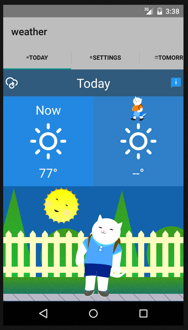
Seems complicated? It can be a little, but once you understand the way each type of layout works with regards to how it handles its children and scales its child content, you will be able to create terrific-looking apps. This app, for example, looks nice on an iPad, iPhone, and Android device:
Notice the way tabbed layouts work on the various devices. It's a great way to observe how the NativeScript framework creates a truly cross-platform Native user experience by presenting users with the UX that is most familiar to them on their platform of choice.
Conclusion
I encourage you to look at various NativeScript examples to understand how layouts can vary from simple to quite complex. Once you understand how they work, you'll be able to create really nice user experiences for your customers! With thanks to Hristo Hristov and TJ VanToll for help on this article