NativeScript Blog
Attack of the Clones: Create a Twitter Clone using Flexbox
Jen Looper
February 21, 2017
Create a Twitter clone with NativeScript and Flexbox
The introduction of Flexbox to create layouts in NativeScript has opened a whole new world of layouting to developers. Yes, ‘layouting’ is a word, as in ‘Are you going to do any fun layouting this weekend’? Actually, there are two main types of layouting in NativeScript - using the Layouts modules like StackLayout and GridLayout, and the new Flexbox layouts. You can use either type of layout for your app; those who are a bit familiar with Flexbox on the web might be happy to use Flexbox in their native app.
What’s the deal with Flexbox, anyway? It’s a well-established way of building up a user interface, especially on the web. The classic example of developing user interfaces with Flexbox is in css-tricks; for visual learners (like me), take a look at this excellent article using animated gifs to explain Flexbox. For a good introduction on using Flexbox with NativeScript, check out TJ’s
article on this blog. TJ also points us to a really cool learning resource: flexboxfroggy.com, where you use Flexbox to arrange a frog and a lilypad in the pond.
The real test of a layouting system, however, is when you need to get a real-world layout built, pronto. Cloning a well-known UI is a great way to create a proof of concept, so let’s give it a try! Recently it struck me that what the world needs is a Twitter client for cats:
There are rly a lot of cats on Twitter tweeting each other. This is perverse, shouldn't they have their own social media, Meowster or Yowwlr
— Jen ➰ (@jenlooper) December 26, 2016
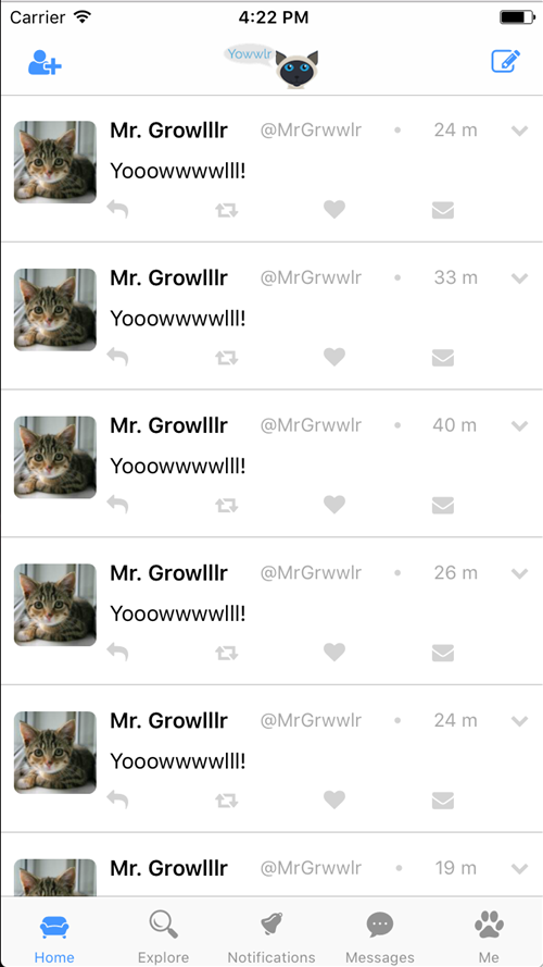
So I decided to create one, Yowwlr. You can follow the progress of this project here (note the business logic of a full Twitter client isn’t in place - the project is used primarily as a layout teaching tool). The project has basic authentication using Firebase, and allows a cat to send yowls (not tweets) which are currently hard-coded. This is a looping layout that is basically a scrolling list of interactions. The layout has a basic shape on mobile, two columns with an image in the first column and three rows nested in the second column:

This layout is accomplished using a combination of markup and css. Fonticons are included by means of Nathan Walker’s NativeScript fonticon plugin, and Firebase is managed by means of Eddy Verbruggen’s Firebase plugin. Within the tabbed interface, let’s build up a page to list the yowls. Start with a ScrollView and a StackLayout, so that the inner content will scroll properly within the tab. Add a FlexboxLayout tag to loop the content returned from Firebase:
<ScrollView>
    <StackLayout>
        <FlexboxLayout class="container" *ngFor="let yowl of (yowls$ | async)">
        </FlexboxLayout>
    </StackLayout>
</ScrollView>
Although you can add all your Flexbox properties right in the markup using camel case (for example <FlexboxLayout justifyContent="center"> ) I found in a business-rule heavy app like this, with considerably nesting of containers, it was easier to manage the Flexbox properties in the css. So I set the .container class to align all the items to flex-start, which means they will align at the top left hand side of the layout area - important for the image, which needs to be placed exactly at the top left:
.container {
  border-bottom-width: 1;
  border-color: lightgray;
  align-items: flex-start;
  padding: 5;
}
I then start building out columns and rows in this layout. First I add two columns, one for the image of the cat, and the other for the nested content (name, date, etc).
<Image class="column" src="~/images/k2" width="120" height="75"></Image>
<FlexboxLayout class="column">
</FlexboxLayout>
These columns are set to be laid out in column format (top to bottom) in the css, and their children are set to not wrap (in Twitter, name, username and date are truncated if they are too long, rather than wrapping). In the case of the image, the css itself is enough to set its flex-direction:
.column {
  flex-direction: column;
  flex-wrap: nowrap;
}
Now it’s time to build out the three nested rows. In the second column, I added three rows.
The first row is the name, username, a little dot as per the Twitter format, a mocked-up date, and a chevron for sharing content. This content is given the justifyContent="space-between" property to space it evenly across the top.
The second row is simply the text of the yowl, and the third row is a row of evenly spaced buttons. The spacing is handled a little differently here; the children of this row are given percentage widths to force the layout to align properly - according to the Twitter pattern, this row of buttons is not justified but rather aligns to the left.
<FlexboxLayout class="row pad" justifyContent="space-between">
   <Label class="bold" [text]="yowl.name"></Label>
   <Label class="small" [text]="'@'+yowl.username"></Label>
   <Label [text]="'fa-circle' | fonticon" class="fa grey tiny"></Label>
   <Label class="small" text="{{yowl.date | date:'mm'}} m"></Label>
   <Label [text]="'fa-chevron-down' | fonticon" class="fa grey small"></Label>
</FlexboxLayout>
<!-- yowl -->
      <Label class="row regular" textWrap="true" [text]="yowl.text"></Label>
<FlexboxLayout class="row pad">
   <Button width="25%" [text]="'fa-mail-reply' | fonticon" class="fa grey"></Button>
   <Button width="25%" [text]="'fa-retweet' | fonticon" class="fa grey"></Button>
   <Button width="25%" [text]="'fa-heart' | fonticon" class="fa grey"></Button>
   <Button width="25%" [text]="'fa-envelope' | fonticon" class="fa grey"></Button>
</FlexboxLayout>
The css for row is simple as well; the content is laid out in rows with no wrap and aligned to flex-start to maintain the baseline alignment in particular of the top elements.
.row {
  flex-direction: row;
  flex-wrap: nowrap;
  align-content: flex-start;
}
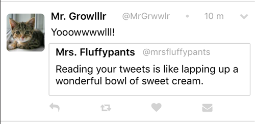
Looking at the Twitter app for any amount of time makes you realize that there are a wealth of possible layouts to emulate. What, for example, happens when someone Retweets (or, in our case, Re-Yowls) a fellow cat?
Well, to support that use case, it’s time to add another nested FlexboxLayout:
<FlexboxLayout class="column ry" borderWidth="1" borderColor="lightgray" borderRadius="2">
    <FlexboxLayout class="row">
          <Label class="bold" text="Mrs. Fluffypants"></Label>
          <Label class="small" text="@mrsfluffypants"></Label>
    </FlexboxLayout>
        <Label class="row regular" textWrap="true" text="Reading your tweets is like lapping up a wonderful bowl of sweet cream."></Label>
</FlexboxLayout>
Here, I added a column FlexboxLayout as a container, and then another FlexboxLayout and a Label styled as a row. Easy! After a while, working with this style of layouts almost starts to feel like working with <divs>. A Re-Yowl looks like this:

Of course, there are many more tweaks we can make to this project. I invite you to participate! In fact, I am offering a prize!
Challenge: Submit a PR to this project that will create another of Twitter’s famous layouts, for example a promoted Tweet (er, Yowl), or a master-detail page that will display a tweet in full. Or go even further and build out the “Me” page in the tab view. If I accept your PR, I’ll send you a NativeScript t-shirt! Have fun and visit http://www.github.com/jlooper/yowwlr to get started!