How to create a NativeScript plugin that uses native iOS & Android views (Part 1) - Label Marquee!
Let's learn how to create a NativeScript plugin which represents any platform native iOS & Android view.
This is Part 1 in a series about creating NativeScript Plugins:
- → Part 1 - Label Marquee
- Part 2 - Shimmer
- Part 3 - Holy Interactivity Batman
One of the most often asked questions around NativeScript is how to create a custom view component for any of the thousands of platform native iOS & Android views out there.
Let's outline the key fundamentals to understand how surprisingly simple and fun it can be.
In fact, a recent client project needed a Marquee effect on a title (auto scrolling text that exceeds the width of the device screen) so it's a perfect opportunity to outline how you can create a custom view component anytime and immediately use it in your project.
Use a workspace to build it
Whenever creating your own NativeScript plugin (or just experimenting with creating new view components), we highly recommend using the official plugin-seed workspace here. It comes ready to create and build quickly without extra hassles, plus prepares you for ease in future maintenance with automated migrations.
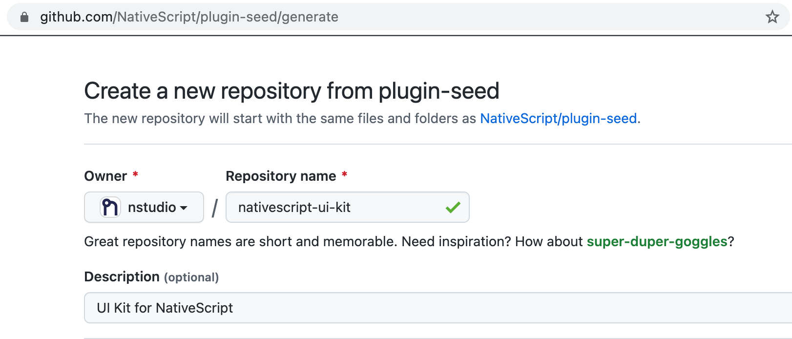
Use the template
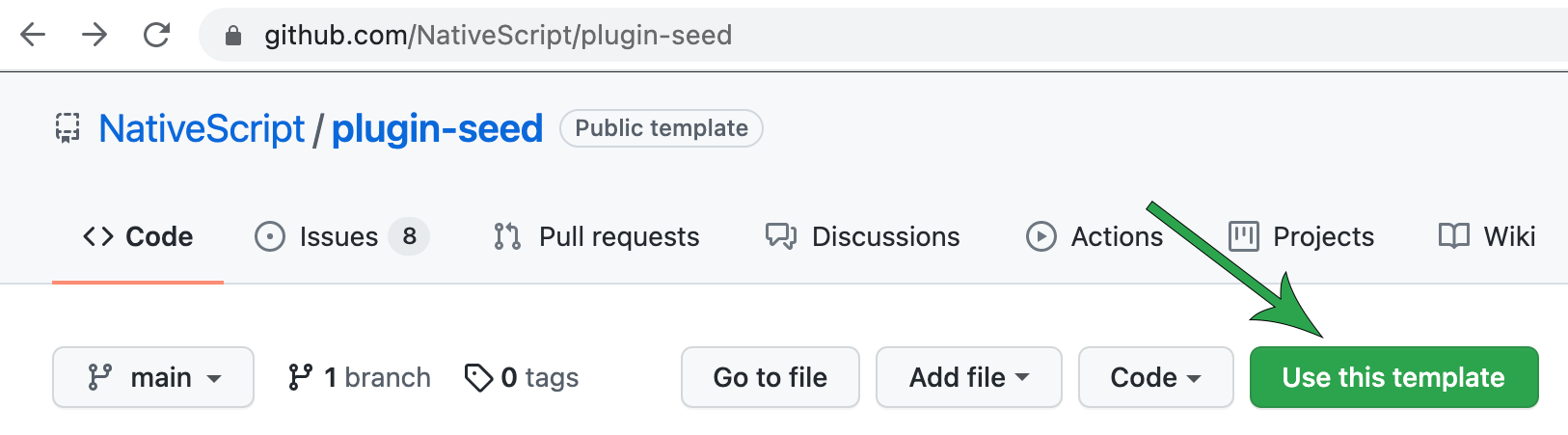
You can choose Use this template right from the repo to create a copy into an organization of your choice and give it a name you prefer:
With our new workspace now in GitHub we can now clone it to begin the fun.
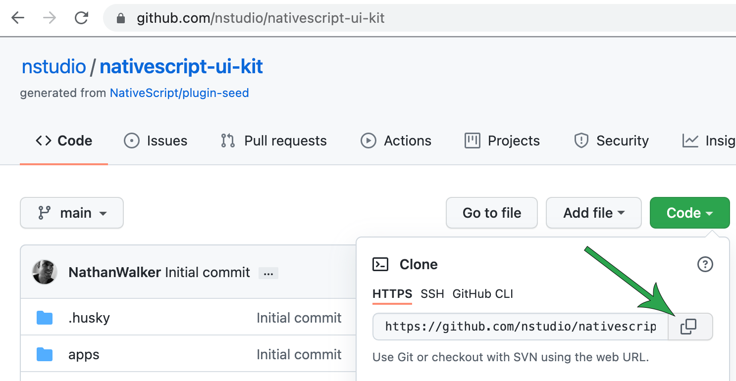
git clone https://github.com/nstudio/nativescript-ui-kit.git
Cloning into 'nativescript-ui-kit'...

cd nativescript-ui-kit
Setup and configure the workspace
- This first step will ensure all the dependencies are installed properly and only really needs to be run once after cloning the workspace. You can also use it anytime you simply want to clean/reset the workspace dependencies.
npm run setup
- Now let's configure it to use the settings we prefer like which organization we want these plugins associated with. This is the difference between
@nativescript/camera(bound to the@nativescriptnpm organization) ornativescript-camera(not bound to any npm organization).
Note: Don't worry, setting the npm scope to an organization when configuring the workspace does not limit you to only creating npm organization bound plugins in this workspace. You can make this choice each time you add a new plugin to it via the prompts.
This will also give us a chance to configure the default package.json repository url and author details we want each package to use.
npm run config

? What npm scope would you like to use for this workspace?
› nstudio

? What is the git repository address?
› https://github.com/nstudio/nativescript-ui-kit

? What is the author display name?
› nstudio

? What is the author email?
> [email protected]
Your workspace is now configured and ready to go!
https://github.com/nstudio/nativescript-ui-kit
We plan to add quite a few ui based plugins to this workspace so this will be the first part in a series of posts discussing the creation of custom view components.
Add label-marquee package
Let's add a package to develop our custom @nstudio/nativescript-label-marquee view component.
npm run add

? What should the new package be named?
› nativescript-label-marquee

? Should it use the npm scope of the workspace?
› true

"@nstudio/nativescript-label-marquee" created and added to all demo apps.
Ready to develop!
This created a packages/nativescript-label-marquee folder containing all the basics of a custom NativeScript plugin you need. It also annotated all the demo apps in the workspace to use it so trying it out is quick and efficient.
Onward we go 🚀
Anatomy of a custom NativeScript view plugin
There's only 2 fundamental required aspects to any custom NativeScript view component (with 2 optional additions):
// 1. (required) extend any NativeScript View
export class CustomView extends View {

  // 2. (required) Construct and return any platform native view
  createNativeView() {
      // return instance of UIView or android.view.View;
  }

  // 3. (optional) initialize anything
  initNativeView() {

  }

  // 4. (optional) cleanup anything
  disposeNativeView() {

  }
}
- "extend any NativeScript View" === any NativeScript view, for example these are also all valid:
export class CustomView extends ContentView { ...

export class CustomView extends Label { ...

export class CustomView extends Button { ...
createNativeViewQuite literally create and return any platform native view, for example these are both valid:
// iOS
createNativeView() {
  return new WKWebView({
    frame: CGRectZero,
    configuration: configuration,
  });
}
// Android
createNativeView() {
  return new android.webkit.WebView(this._context);
}
-
initNativeViewInitialize anything you'd like -
disposeNativeViewDestroy and cleanup anything if needed
Preparing nativescript-label-marquee
We will notice that each newly added package comes ready with files for us to develop:
common.tsThe common shared code between iOS and Androidindex.android.tsAndroid specific codeindex.d.tsTypings for ease of use in projectsindex.ios.tsiOS specific code
First of all we want our custom view component to be called LabelMarquee so we can use it within NativeScript view markup with <LabelMarquee></LabelMarquee>. Newly added packages always start out with a class name that matches the package name we added.
Since Android and iOS implementations always derive from the common base class, let's adjust common.ts to name our base appropriately from this:
export class NativescriptLabelMarqueeCommon extends Observable {
}
to this:
export class LabelMarqueeCommon extends Observable {
}
We notice that it extends Observable by default. Not to be confused with rxjs Observable, it is common within NativeScript hierarchy that all components will derive from the NativeScript Observable from @nativescript/core. It was developed many years ago before rxjs was even a thing so the name has always stuck around. It simply means the class provides the basic building blocks within all NativeScript constructs to provide the ability to emit events on property changes and emit custom events on it's own.
Since we are creating a custom view component in this case we can extend from View which itself already inherits from Observable. However you can extend from anything provided by @nativescript/core to create custom behavior.
In fact because we are essentially creating a new Label with added effects we can simply extend the already existing Label which also extends from View.
import { Label } from '@nativescript/core';

export class LabelMarqueeCommon extends Label {
}
We now update index.ios.ts and index.android.ts to match and represent each platform implementation:
import { LabelMarqueeCommon } from './common';

export class LabelMarquee extends LabelMarqueeCommon {

}
This will create a new LabelMarquee view component which simply mimics the behavior of the base level Label class within NativeScript.
Let's now add in our custom view implementation details. ✨
Use a third party or code directly?
This can often be the hardest decision we make as developers. When it comes to custom NativeScript view components the sky is the limit. Meaning anything we find in open source off the shelf we always have the option to code using NativeScript directly into our plugin removing any reliance on a third party. The discretion to do one or the other is always at your fingertips. For us, if the history of any third party open source plugin is strong we often proceed using it with peace of mind knowing that if down the road it becomes unmaintained we have the option to code it directly into the plugin in the future.
In this case, achieving a label marquee effect on iOS has been made available by this wonderful open source author: https://github.com/cbpowell/MarqueeLabel
For Android, it turns out the android.widget.TextView used already in @nativescript/core provides options to achieve this effect: https://developer.android.com/reference/android/widget/TextView#setEllipsize(android.text.TextUtils.TruncateAt) + https://developer.android.com/reference/android/text/TextUtils.TruncateAt#MARQUEE
So we'll work with both of these as our guide.
Add platforms folder to support the third party dependency
We'll start with implementing iOS first.
With iOS cbpowell/MarqueeLabel provides a CocoaPod which we can include by creating a platforms/ios/Podfile in the package to reference it like this:
packages/nativescript-label-marquee/platforms/ios/Podfile
pod 'MarqueeLabel'
Every NativeScript plugin which contains a platforms folder means there is going to be an ios or android folder inside that will often contain any number of platform native source code, configurations or dependencies which will become part of the NativeScript app they are added to.
Generate the typings to work with it
Now that we have the plugin setup with the third party dependencies we can use the demo app in the workspace to generate TypeScript declarations (aka, types, typings, etc.) to strongly type our plugin against making our development fun and rewarding.
cd apps/demo
ns typings ios
This will create a apps/demo/typings folder which contains all the TypeScript declarations for the native platform APIs included in the demo app which also includes our newly added cbpowell/MarqueeLabel plugin!
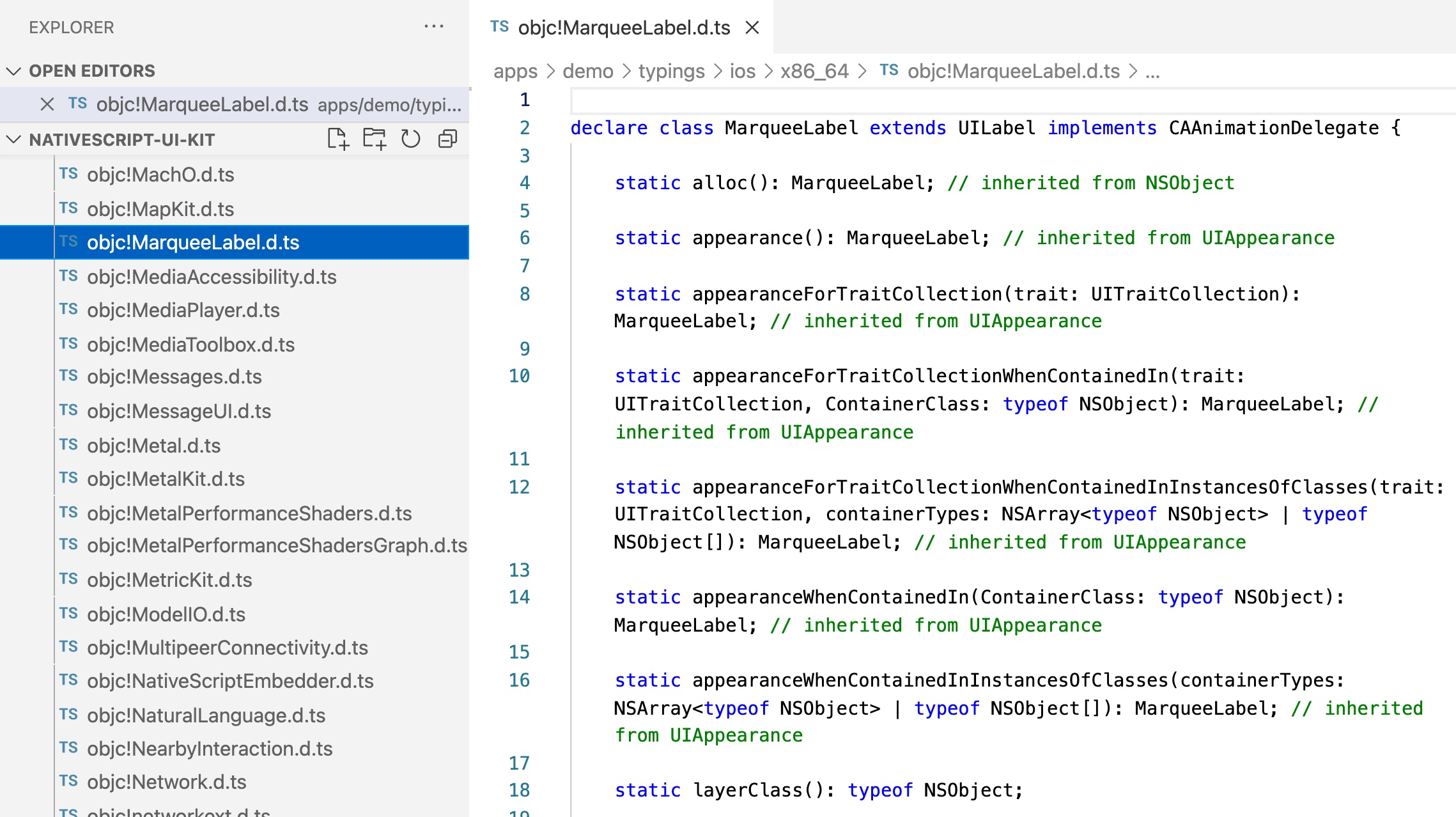
We can move these typings into our plugin to aid our development of the custom view component.
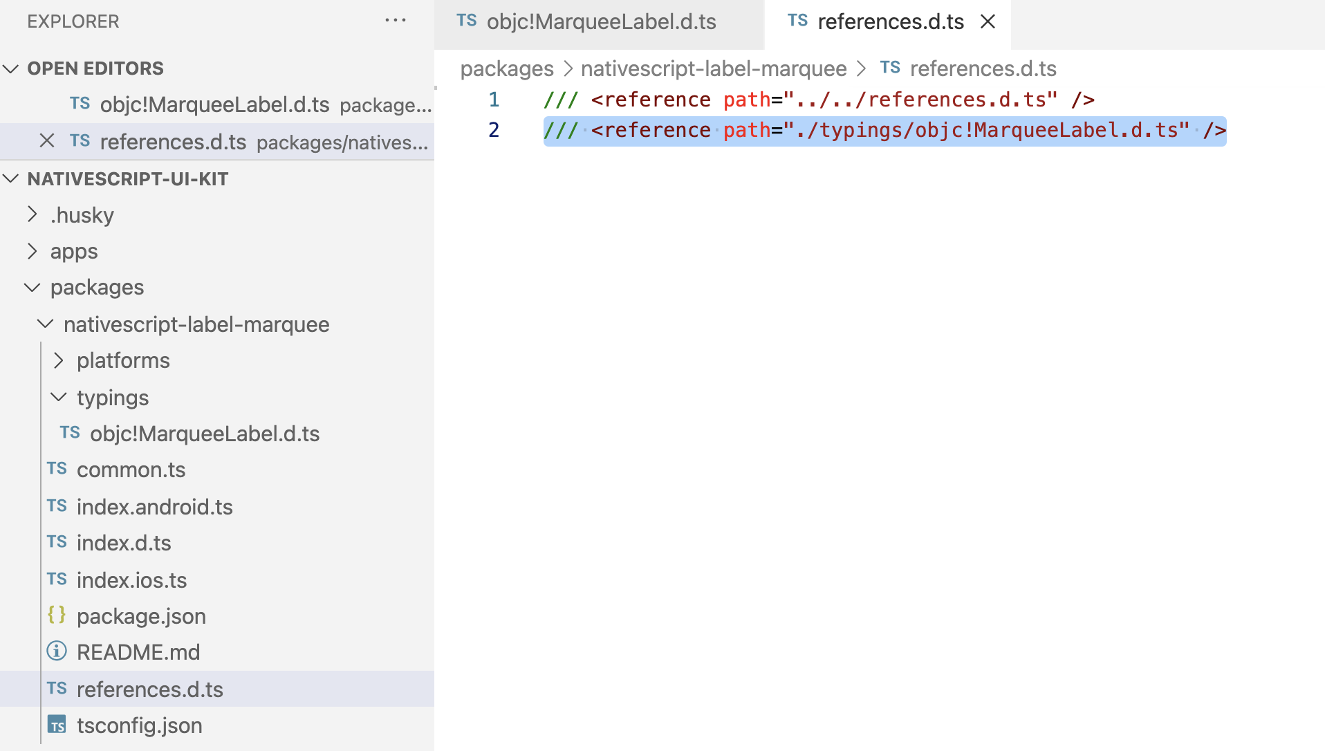
Create a packages/nativescript-label-marquee/typings folder and place the objc!MarqueeLabel.d.ts in it:
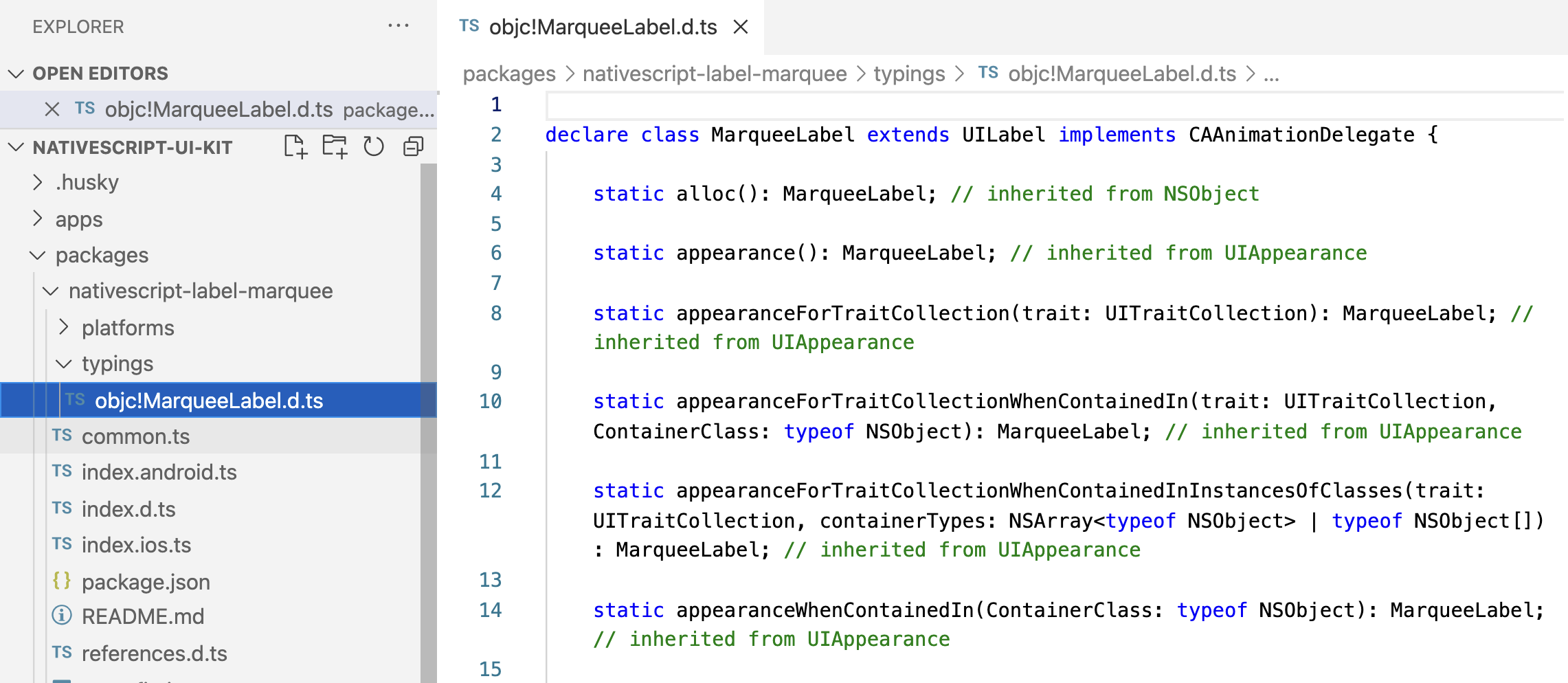
We can now add it to the package references.d.ts to ensure our TypeScript editor allows us to code directly against those types.
Note: You can now delete the apps/demo/typings folder as we won't be needing it any longer.
This allows us to code with the native platform API which is provided by the cbpowell/MarqueeLabel iOS CocoaPod.
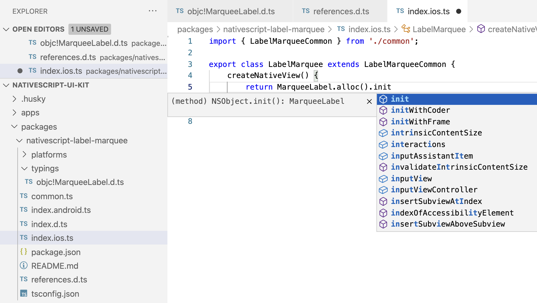
createNativeView
Since our LabelMarquee component should provide an instance of a label with the marquee effect we will just return an instance of cbpowell/MarqueeLabel.
import { LabelMarqueeCommon } from './common';

export class LabelMarquee extends LabelMarqueeCommon {
  createNativeView() {
    return MarqueeLabel.alloc().init();
  }
}
With a lot of iOS classes you can often use the standardized alloc().init() method chain to initialize a proper instance of an Objective C or Swift class. Various plugins may provide different initializers which you will find in the generated typings for each plugin which is why having the typings at your disposal makes custom view component development quite nice. With Objective C, alloc is short for allocate and historically refers to the static creation of a memory allocated instance of a class whereby you can then invoke methods on that instance, such as init (a default initializer).
initNativeView
Next we can initialize any default settings on our custom view. cbpowell/MarqueeLabel supports fadeLength which determines the distance the label should fade out on the portion of text that exceeds the visible screen width. It also supports scrollDuration which determines how fast the scroll animation should occur.
We will set these to some reasonable defaults.
import { LabelMarqueeCommon } from './common';

export class LabelMarquee extends LabelMarqueeCommon {
  createNativeView() {
    return MarqueeLabel.alloc().init();
  }

  initNativeView() {
    const nativeView = <MarqueeLabel>this.nativeView;
    nativeView.fadeLength = 10;
    nativeView.scrollDuration = 8;
  }
}
Here we use the default NativeScript getter this.nativeView which represents the instance of the native view that was created with createNativeView. We cast it to the proper native type MarqueeLabel which gives us intellisense in our code editor and strong type checking when setting it's various properties for ease of future maintenance.
We'll skip handling disposeNativeView for now since it doesn't appear there's anything we need to cleanup upon destroy yet however we can add it later if we need to.
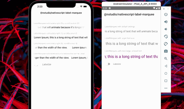
Try out the new custom view component!
Believe it or not, that's all it takes to create a custom NativeScript view component for a target platform of choice (we'll add the Android implementation after we confirm iOS works properly).
We are ready to try it out in our demo app.
When we added the package above using npm run add it actually created demo pages, annotated all demo apps to use it and added supporting shared code for the package across all demo apps in the workspace. We can just drop our view component in one of those pages to verify it works.
Which flavor you choose to demo your custom plugins with is up to you; we'll just show adding it to the vanilla demo for brevity (apps/demo).
We can add a namepsace to our Page element:
- Add namespace to
Page:xmlns:lm="@nstudio/nativescript-label-marquee" - Use the new custom view component:
<lm:LabelMarquee text="Lorem Ipsum; this is a long string of text that will animate because it's longer than the width of the view."></lm:LabelMarquee>
apps/demo/src/plugin-demos/nativescript-label-marquee.xml:
<Page xmlns="http://schemas.nativescript.org/tns.xsd"
  navigatingTo="navigatingTo" class="page"
  xmlns:lm="@nstudio/nativescript-label-marquee">
  <Page.actionBar>
    <ActionBar title="LabelMarquee" class="action-bar">
    </ActionBar>
  </Page.actionBar>
  <StackLayout class="p-20">
    <ScrollView class="h-full">
      <StackLayout>
        <lm:LabelMarquee text="Lorem Ipsum; this is a long string of text that will animate because it's longer than the width of the view."></lm:LabelMarquee>
      </StackLayout>
    </ScrollView>
  </StackLayout>
</Page>
Run the iOS demo
We can run our demo app either of two ways:
npm startto display menu. Then typedemo.iosand ENTER.- We can also run it directly by invoking:
nx run demo:ios
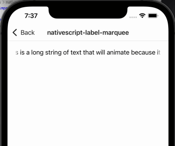
Pretty neat 😊
Add more options
The cbpowell/MarqueeLabel plugin exposes quite a number of nifty options. Let's add support for a few of them via properties that users can set on the view component.
To start we can add properties to allow developers to set their own fadeLength and scrollDuration values to override our defaults we setup with initNativeView.
Without knowing what properties will be fully supported with Android we can create properties for both iOS and Android with the assumption that we may be able to support the same properties in the Android implementation when we get to that shortly.
Let's add property definitions to common.ts so both index.ios.ts and index.android.ts can implement them where possible.
What's this Property thing?
In order to define properties that we'd like our custom view component to expose for developers to dynamically change it's visual characteristics, we could use a good ole' class property setter. However, NativeScript provides something above and beyond to help here which is even better.
@nativescript/core Property is a class, among other related classes like CssProperty, which are all used to define properties. You could simply use a setter in your class however the Property class (and it's associates) provide several handy utilities baked into them which reduce a lot of worry under various use cases like when the property should set it's value based on whether the underlying native class is available (been initialized) and ready to have properties set. It also bakes in automatic event emission via NativeScript's Observable which helps notify listeners when properties change.
common.ts
// 1. import the Property class
import { Label, Property } from '@nativescript/core'

export class LabelMarqueeCommon extends Label {}

// 2. define a new property
// "name" Will become the view attribute which developers can use
export const fadeLengthProperty = new Property<LabelMarqueeCommon, number>({
  name: 'fadeLength',
})

// 3. register the property with the view component class
fadeLengthProperty.register(LabelMarqueeCommon)
This defines a new property fadeLength which we can use to modify platform specific behavior when a developer wants to customize how the view component works.
Let's use it in our iOS implementation:
index.ios.ts
import { LabelMarqueeCommon, fadeLengthProperty } from './common';

export class LabelMarquee extends LabelMarqueeCommon {

  createNativeView() {
    return MarqueeLabel.alloc().init();
  }

  initNativeView() {
    const nativeView = <MarqueeLabel>this.nativeView;
    nativeView.fadeLength = 10;
    nativeView.scrollDuration = 8;
  }

  [fadeLengthProperty.setNative](value: number) {
    (<MarqueeLabel>this.nativeView).fadeLength = value;
  }
}
We import the fadeLengthProperty and define a new property using it's setNative api which creates a super charged setter bound by the property name. This will handle all the specific behavior of setting native properties at appropriate times on our view components when those properties dynamically change by developers using them. Including common parsing logic for anything the property needs to logically handle in specific ways (more on that below).
To avoid the class casting (<MarqueeLabel>this.nativeView) for our strong type checking, we will use a common NativeScript approach which is baked into all view components. Using the ios and android getters to simplify our development and maintenance into the future. These getters are available under the hood of all NativeScript view components. They will always return the concrete native class implementation for that specific platform. We can override them in each platform implementation source file to return the platform specific class which improves our quality of life tremendously:
import { LabelMarqueeCommon, fadeLengthProperty } from './common';

export class LabelMarquee extends LabelMarqueeCommon {

  // @ts-ignore
  get ios(): MarqueeLabel {
    return this.nativeView;
  }

  createNativeView() {
    return MarqueeLabel.alloc().init();
  }

  initNativeView() {
    this.ios.fadeLength = 10;
    this.ios.scrollDuration = 8;
  }

  [fadeLengthProperty.setNative](value: number) {
    this.ios.fadeLength = value;
  }
}
Lovely 😍
We now have a way to dynamically change the fadeLength:
<LabelMarquee
  text="Lorem Ipsum; this is a long string of text that will animate because it's longer than the width of the view."
  fadeLength="20"></LabelMarquee>
Add Android Implementation
The Label for Android in @nativescript/core already is an android.widget.TextView which supports a marquee effect natively so let's just enable it with our plugin and give developers control over when to enable it.
Since our plugin already extends Label there's not much we even need to do here.
index.android.ts
import { LabelMarqueeCommon } from './common';

export class LabelMarquee extends LabelMarqueeCommon {

  // @ts-ignore
  get android(): android.widget.TextView {
    return this.nativeView;
  }

  initNativeView() {
    this.android.setSingleLine(true);
    this.android.setEllipsize(android.text.TextUtils.TruncateAt.MARQUEE);
    this.android.setMarqueeRepeatLimit(-1); // -1 is infinite
    this.android.setSelected(true);
  }
}
There's numerous articles on how to enable marquee effect on Android; the above was derived from here.
Let's add another property that would give developers the ability to turn off the scrolling text whenever they want. We'll call the new property labelize and add it to common so we can implement it on both Android and iOS:
common.ts
import { Label, Property, booleanConverter } from '@nativescript/core';

export class LabelMarqueeCommon extends Label {
}

export const fadeLengthProperty = new Property<LabelMarqueeCommon, number>({
  name: 'fadeLength'
});
fadeLengthProperty.register(LabelMarqueeCommon);

export const labelizeProperty = new Property<LabelMarqueeCommon, boolean>({
  name: 'labelize',
  defaultValue: false,
  valueConverter: booleanConverter,
});
labelizeProperty.register(LabelMarqueeCommon);
Here we see more powers of the Property class coming to life which provide a seamless and reusable way to bake value parsing (from the view markup value input to actual class property value setting) right into the property definition itself. Since we define the labelizeProperty as a boolean and the view will send the value in as a string (since view component markup is just a string!), the Property class gives us an api where we can define various value parsing logic. @nativescript/core even provides dozens of value converters, one such being the booleanConverter which gives us the ability to tighten our component integrity right through the property setter itself ensuring any value coming in is converted to a valid boolean value required by our platform implementations.
Now let's use it to expose yet another useful property developers can use to customize the behavior of our custom view component.
index.android.ts
import { LabelMarqueeCommon, labelizeProperty } from './common';

export class LabelMarquee extends LabelMarqueeCommon {

  // @ts-ignore
  get android(): android.widget.TextView {
    return this.nativeView;
  }

  initNativeView() {
    this.android.setSingleLine(true);
    this.android.setEllipsize(android.text.TextUtils.TruncateAt.MARQUEE);
    this.android.setMarqueeRepeatLimit(-1); // -1 is infinite
    this.android.setSelected(true); // starts the scrolling effect
  }

  [labelizeProperty.setNative](value: boolean) {
    this.android.setSelected(!value);
    const ellipsis = value ? android.text.TextUtils.TruncateAt.END : android.text.TextUtils.TruncateAt.MARQUEE;
    this.android.setEllipsize(ellipsis);
  }
}
At this point we have completed the Android implementation now as well. We could continue adding more properties and abilities. For example some additional ideas we may revisit in a future post to expand on this:
- Changing scrollDuration/speed: https://stackoverflow.com/a/8971920/2192332
- Changing the marquee repeat limit: https://www.tabnine.com/code/java/methods/android.widget.TextView/setMarqueeRepeatLimit
Before we get ahead of oursevles, let's make our new labelize property also work on iOS.
Reuse new labelize property for iOS as well
Since we created labelizeProperty in common.ts we can simply use it to add to our iOS implementation as well.
index.ios.ts
import { LabelMarqueeCommon, fadeLengthProperty, labelizeProperty } from './common';

export class LabelMarquee extends LabelMarqueeCommon {

  // @ts-ignore
  get ios(): MarqueeLabel {
    return this.nativeView;
  }

  createNativeView() {
    return MarqueeLabel.alloc().init();
  }

  initNativeView() {
    this.ios.fadeLength = 10;
    this.ios.scrollDuration = 8;
  }

  [fadeLengthProperty.setNative](value: number) {
    this.ios.fadeLength = value;
  }

  [labelizeProperty.setNative](value: boolean) {
    this.ios.labelize = value;
  }
}
We now have a way to toggle the text marquee scrolling effect on and off using the same API for both iOS and Android:
<LabelMarquee
  text="Lorem Ipsum; this is a long string of text that will animate because it's longer than the width of the view."
  [labelize]="labelizeEnabled"></LabelMarquee>
Use right away in your project!
So you may be asking yourself, well this is great but the whole point of creating this custom view component was because we need it in an actual live project right now!
Well yeah, so let's pack it up and use it 📦
At this point you can either publish it to npm or simply pack it into a .tgz. Both are quick and effective ways to use this new view component right away in your project. I'll show you how to do both.
Pack it up
All builds will output to dist/packages/{package-name}.
npm start
> type "labelmarquee.build"
// then hit ENTER to kick off the plugin build

// This is a convenient way to see all commands in your workspace
// Typing any first few characters of something you're looking for will narrow it down
You will notice that anytime you hit ENTER on any command in the npm start menu, a green command will output which is the actual Nx command executed. You can use that direct command anytime you'd like if you find going through the npm start menu unnecessary. For example nx run nativescript-label-marquee:build.all does exactly the same thing as what we just did using the npm start interactive menu.
You can now navigate into the output and pack it up.
cd dist/packages/nativescript-label-marquee
npm pack
This will create a nstudio-nativescript-label-marquee-1.0.0.tgz file which you can simply drop into any project and reference in it's package.json as follows:
"@nstudio/nativescript-label-marquee": "file:nstudio-nativescript-label-marquee-1.0.0.tgz"
Now just ns clean and run your project to enjoy using your new view component.
Publish it to npm
If you have tested your plugin and believe it's ready for primetime then you can publish it to npm.
npm run publish-packages

? Which packages 📦 would you like to publish?
› nativescript-label-marquee

? What 🆕 version would you like to publish?
› 1.0.0

? Sanity check 🧠 Are you sure you want to publish? (y/N)
› y
Your package will then be published to npm. Granted you must be logged into a valid npm account that has permissions to publish.
The publish-packages workflow is quite convenient and fast.
-
When prompted with
Which packages 📦you can optionally hit enter without typing any name and it will sequentially publish ALL packages inside the workspace making managing entire suites of plugins a joy. -
When prompted with
What 🆕 versionyou can either explicitly type a version string to use or simply hit enter to have it auto bump the patch version. You can also usealpha,beta, andrcversion strings which the workflow will detect and auto tag it properly on npm. For example,1.0.0-alpha.0would tag it withalphaon npm. -
When prompted with
Sanity check 🧠, well...just check your head.
Enjoying the View
Ahh, lovely seeing this in a live project now...