Harness the power of CollectionView (Part 1) - Swipeable cells for iOS
Let's learn how to harness all the options of CollectionView, a powerful and versatile list control for numerous use cases built completely by the NativeScript community.
This is Part 1 in a series highlighting CollectionView, a super powered list control with recycled rows providing you best of class on each platform suited to fit all sorts of needs.
- → Part 1 - Swipeable cells for iOS
- Part 2 - Swipeable cells for Android
- Part 3 - Dynamic layout changes
- Part 4 - Pull to refresh and infinite loading
As of the writing of this series, several list controls are available to use with NativeScript including @nativescript/core's ListView, RadListView, and the community's CollectionView. Depending on your needs, any could be appropriate:
- Core's
ListViewis best suited for simple cases where just needing a listing with customizable row styles. RadListViewhad often been a power list control with advanced features such as swipable rows, sorting, grouping, pull to refresh, load on demand, etc. however it has aged over time and the community has an emerging successor that can do all of these features with more ease and extensibility.CollectionViewwas brought to the community by a multi-talented long time contributor Martin Guillon and offers modern iOS and Android platform features with ideal performance.
CollectionView is the natural successor to RadListView because it uses UICollectionView on iOS and RecyclerView on Android, both highly optimized platform controls for list handling.
Harness layoutStyle to customize behavior
CollectionView supports a layoutStyle property allowing you to register custom platform behavior against the control, for example:
<CollectionView layoutStyle="swipe" />
This can be any string value used to identify a custom registered layout style:
CollectionView.registerLayoutStyle('swipe', {
  createLayout: () => {
    // return a customized platform layout here!
    return layout;
  },
});
The layouts possible on iOS can be anything in the UICollectionViewLayout family which is incredibly rich and extensive. It provides an abstract base class for variety of layouts like UICollectionViewFlowLayout and UICollectionViewCompositionalLayout.
Rather than go through all you have at your disposal here, we're going to look at implementing swipe cells with one of them. It just so happens to be the exact same layout used by the official iOS Mail app on every iOS device, UICollectionViewCompositionalLayout.
Numerous tutorials can be found covering this; here's just a few:
- https://www.donnywals.com/how-to-add-custom-swipe-actions-to-a-uicollectionviewlistcell/
- https://nemecek.be/blog/164/how-to-add-swipe-actions-to-collection-view
- https://lickability.com/blog/getting-started-with-uicollectionviewcompositionallayout/
One of the neatest things about NativeScript is the documentation and tutorials for a lot of the things you want to do are already available in variety of platform sources because after all, NativeScript gives you exactly that platform in JavaScript!
Implement UICollectionViewCompositionalLayout for swipeable cells
We can create one with a single api:
UICollectionViewCompositionalLayout.layoutWithListConfiguration(config);
So what configuration do we want? ...One with some leading and trailing swipe actions!
Using the tutorials mentioned above as our guide we could implement 1 leading and 1 trailing swipe action as follows:
CollectionView.registerLayoutStyle('swipe', {
  createLayout: () => {
    const config =
      UICollectionLayoutListConfiguration.alloc().initWithAppearance(
        UICollectionLayoutListAppearance.Plain
      );
    config.showsSeparators = true;

    config.leadingSwipeActionsConfigurationProvider = (p1: NSIndexPath) => {
      const readAction =
        UIContextualAction.contextualActionWithStyleTitleHandler(
          UIContextualActionStyle.Normal,
          'Read',
          (
            action: UIContextualAction,
            sourceView: UIView,
            actionPerformed: (p1: boolean) => void
          ) => {
            console.log('read actionPerformed!');
            actionPerformed(true);
          }
        );
      readAction.backgroundColor = UIColor.systemBlueColor;
      readAction.image = UIImage.systemImageNamed('envelope.badge.fill');
      return UISwipeActionsConfiguration.configurationWithActions([readAction]);
    };

    config.trailingSwipeActionsConfigurationProvider = (p1: NSIndexPath) => {
      const moreAction =
        UIContextualAction.contextualActionWithStyleTitleHandler(
          UIContextualActionStyle.Normal,
          'More',
          (
            action: UIContextualAction,
            sourceView: UIView,
            actionPerformed: (p1: boolean) => void
          ) => {
            console.log('more actionPerformed!');
            actionPerformed(true);
          }
        );
      moreAction.backgroundColor = UIColor.systemGray4Color;
      moreAction.image = UIImage.systemImageNamed('ellipsis.circle.fill');
      return UISwipeActionsConfiguration.configurationWithActions([moreAction]);
    };

    return UICollectionViewCompositionalLayout.layoutWithListConfiguration(
      config
    );
  },
});
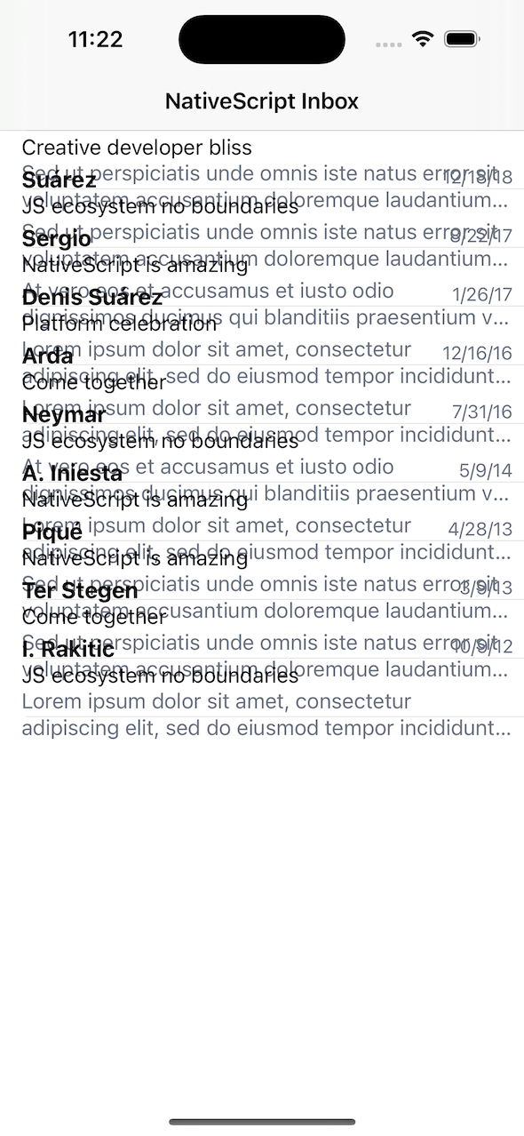
If we were to run this on iOS (ns debug ios) with CollectionView markup, styled with TailwindCSS, like this:
<CollectionView [items]="items" layoutStyle="swipe">
  <ng-template let-item="item">
    <GridLayout class="p-2">
      <Label text="CollectionView is really great" class="text-lg"></Label>
    </GridLayout>
  </ng-template>
</CollectionView>
We would see this:
That's all? Yes.
You mean that's all it takes to have swipeable cells with identical UX as iOS Mail app? Yes.
The image icons used were built-in system icons already available on iOS:
One of the fundamental tenants with NativeScript is that it's approach seeks to allow the platform to be the guiding light always. If you're going to use a cross platform approach at all, it wants to be sure the platform represents it's true self 100% of the time, never limiting you, rather just empowering you with more options.
Taking things further with customizations to CollectionView
The NativeScript community is highly extensible. What should you do if you encounter something unexpected?
Let's use this as example of precisely that. Expanding on our example to include more detail in our row layouts to mirror more of the layout of iOS Mail app itself, we could express the layout like this:
<CollectionView [items]="items" layoutStyle="swipe">
  <ng-template let-item="item">
    <GridLayout rows="auto,auto,auto" class="pl-4 pr-2 py-4 v-center">
      <Label
        [text]="item.name"
        class="text-[17px] font-bold align-middle"
      ></Label>
      <Label
        row="1"
        [text]="item.subject"
        class="text-base leading-none align-middle"
      ></Label>
      <Label
        row="2"
        [text]="item.body"
        class="text-base leading-none text-gray-500"
        maxLines="2"
      ></Label>
      <GridLayout rowSpan="3" columns="auto,auto" class="align-top h-right">
        <Label
          [text]="item.date | date : 'shortDate'"
          class="text-sm align-middle text-gray-500"
        ></Label>
      </GridLayout>
    </GridLayout>
  </ng-template>
</CollectionView>
We would now see this problem:
This happens to be natural iOS behavior with dynamic cell height in UICollectionViewCompositionalLayout which is described here in part:
The problem is that when using compositional layout with a list style containing rows with custom layout and supporting swipes, there's some extra considerations the layout logic needs to calculate the row height properly.
We have a number of options in these situations.
- A. reach out on the NativeScript Community Discord for help
- B. make changes to the plugin inside
node_modulesto find a solution that works - C. fork the plugin repo to experiment with the source
- D. if having trouble running the plugin repo—move the source into a location you can experiment with effectively
- E. once a solution is found, contribute a solution to the original plugin author for inclusion consideration in a future release
- F. report an issue against the plugin repo
- G. reach out to professional partners for assistance
You may find any of those avenues helpful and we would encourage trying any. For this case, we're going to go straight to E because in this series we're going to cover a good bit of ground and want to ensure we can customize anything if needed easily. We simply moved the source from nativescript-community/ui-collectionview to nstudio/nativescript-ui-kit, which uses the recommended plugin workspaces. This puts it into a setup we're comfortable with when making any number of changes. We can then later decide what customizations the original author may want via a pull request contribution to the original source repo.
In a lot of cases, patch-package could even work to make an adjustment to a node_modules plugin if needed and it would work in this case as well.
For clarity let's look at the source code change needed. We needed to add one method to the CollectionViewCell which is not exported currently for customization (likely will become a future PR to the author here!):
@NativeClass
class CollectionViewCell extends UICollectionViewCell {
  owner: WeakRef<ItemView>;

  get view(): ItemView {
    return this.owner ? this.owner.deref() : null;
  }

  // We needed this!
  systemLayoutSizeFittingSizeWithHorizontalFittingPriorityVerticalFittingPriority(
    targetSize: CGSize,
    horizontalFittingPriority: number,
    verticalFittingPriority: number
  ): CGSize {
    const owner = this.owner?.deref();
    if (owner) {
      const dimensions = {
        measuredWidth: owner.getMeasuredWidth(),
        measuredHeight: owner.getMeasuredHeight(),
      };
      return CGSizeMake(
        Utils.layout.toDeviceIndependentPixels(dimensions.measuredWidth),
        Utils.layout.toDeviceIndependentPixels(dimensions.measuredHeight)
      );
    }
    return targetSize;
  }
}
With that in place we get our custom cell layout with swipeable cells and the UX is superb 👌
To customize and publish or to PR and wait?
This is a tough question everytime. Generally we always try our very best to PR a plugin change and wait for the author to review for a future release - we really like to talk to authors in such cases if we're able as well. Here's a guideline we could recommend in such cases:
- Obtain a solution through any of the A-G options mentioned above.
- Integrate the solution using
patch-packagein your project to unblock yourselves or alternatively if you cloned the source to prepare a pull request, you cannpm packthe changes to a.tgzand reference in your project in the meantime. - Post a pull request to begin a conversation with the plugin author.
We published this customized CollectionView on npm (@nstudio/ui-collectionview) as we will begin using this in the series, including on StackBlitz, and even on some projects while we explore other directions. We may even steer in totally new directions in this series so we'll have a customized target to do so safely without affecting the community in the meantime. After we've made it through all we want to cover, we can then prepare a pull request with all the changes we believe may benefit the original author as well as the broader community.
About nStudio
Founded in 2016 by open source collaborators, nStudio is recognized for establishing a healthy open source governance model to serve the global communities interest around NativeScript. If you are in need of professional assistance on your project, nStudio offers services spanning multiple disciplines and can be reached at [email protected].