Building a Simple Progressbar for your NativeScript App
Progressbars are a common user interface component regardless of development platform. In this article we’ll look at how you can easily recreate this UI component for your NativeScript apps, and learn a bit about NativeScript’s layout system in the process.
Progressbars are a common user interface component that usually look something like this.

In this article we’ll look at how you can easily recreate progressbars like this for your NativeScript apps, and learn a bit about NativeScript’s layout system in the process.
Progressbar markup
To create a simple progressbar you only need two NativeScript components, a <GridLayout> to use as the outer container of the progressbar, and a <StackLayout> to serve as the filled-in portion of the bar.
<GridLayout columns="3*, *" class="progressbar">
  <StackLayout col="0" class="progressbar-value"></StackLayout>
</GridLayout>
The key thing driving this example is the GridLayout’s columns attribute, as it controls the progressbar’s width, but let’s start by adding a bit of CSS to make these controls look like a progressbar.
.progressbar {
    height: 50;
    margin: 10;
    border-radius: 10;
    border-color: black;
    border-width: 1;
}
.progressbar-value {
    background: #337ab7;
}
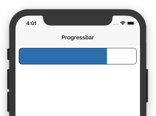
With that CSS in place you should have a progressbar that looks like this.

If you have more design talent than me you might want to play with different colors, and maybe even experiment with NativeScript’s new support for linear gradient backgrounds.
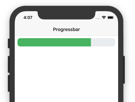
Just to give you an idea of what’s possible, here’s a slightly different look for the same progressbar with a bit of alternative CSS.
.progressbar {
    height: 30;
    margin: 10;
    border-radius: 10;
    background: #ECEFF1;
}
.progressbar-value {
    background: #51BC6B;
}

Regardless of how you choose to style your progressbar, the next thing you need to do is come up with a way of controlling the bar’s width. Let’s look at how to do that.
Progressbar logic
To explain how this is going to work, let’s return to this example’s markup.
<GridLayout columns="3*, *" class="progressbar">
  <StackLayout col="0" class="progressbar-value"></StackLayout>
</GridLayout>
In this example, the GridLayout specifies two columns, one with a width of 3*, and another with a width of *. This creates four units of width, and assigns three to the first column, and one to the second. This is why the bar takes up 75% of the overall width in our example.

To make this width dynamic, all you need to do is dynamically assign that width in JavaScript or TypeScript. Using Angular, that code looks a little something like this.
<GridLayout [columns]="columns" class="progressbar">
  <StackLayout col="0" class="progressbar-value"></StackLayout>
</GridLayout>
import { Component, OnInit } from "@angular/core";

@Component({
    ...
})
export class ItemsComponent implements OnInit {
  columns;

  ngOnInit(): void {
    this.setProgressbarWidth(20);
  }
}

  setProgressbarWidth(percent) {
    this.columns = percent + "*," + (100 - percent) + "*";
  }
}
Here, you bind the columns attribute of the GridLayout to a columns property in your Angular component.
In the component, you also define a setProgressbarWidth() method, which takes a 0–100 integer and sets the attribute to appropriate value.
NOTE: If you’re confused by exactly what
setProgressbarWidth()does try running through the logic with a few specific values. For example, if you pass in70the method sets thecolumnsproperty to70*,30*; if you pass in50the method sets thecolumnsproperty to50*,50*.
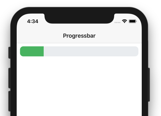
With this code you can now easily use TypeScript code to set the progressbar’s width to a percentage width. For example, the code above renders a progressbar that looks like this.

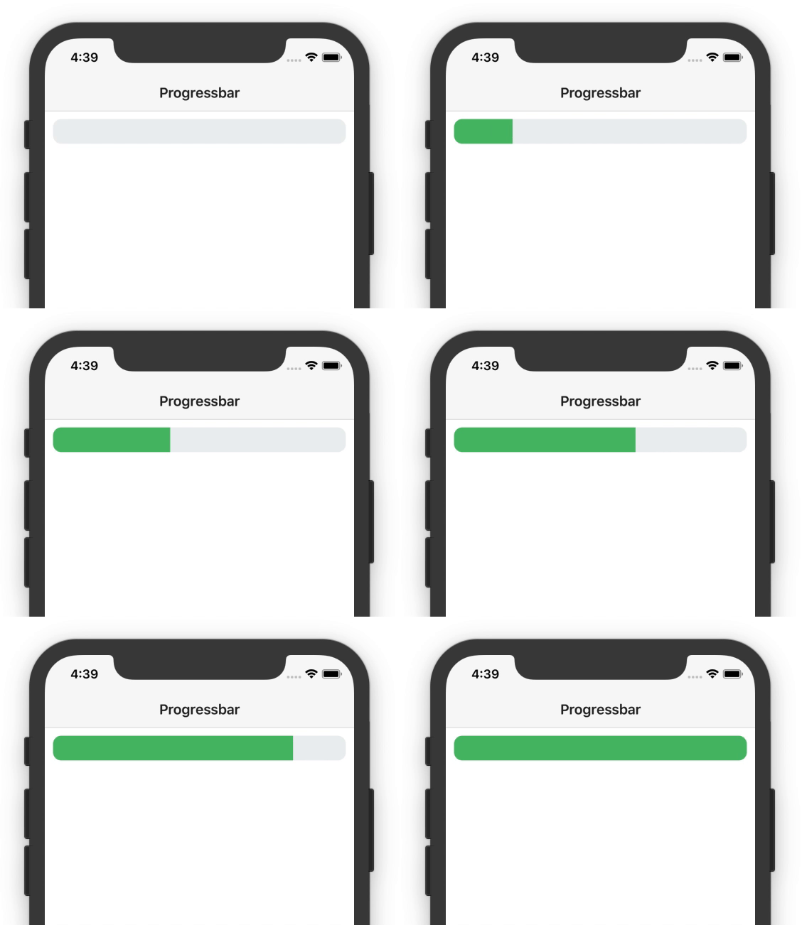
To make the progressbar move all you need to do is call setProgressbarWidth() with a new value. For example, the following code moves a progressbar from 0–100.
import { Component, OnInit } from "@angular/core";

@Component({
  ..
})
export class ItemsComponent implements OnInit {
  columns;

  ngOnInit(): void {
    let percent = 0;
    let intervalId = setInterval(() => {
      this.setProgressbarWidth(percent);
      percent++;
      if (percent > 100) {
        clearInterval(intervalId);
      }
    }, 50);
  }

  setProgressbarWidth(percent) {
    this.columns = percent + "*," + (100 - percent) + "*";
  }
}

Wrapping up
Hopefully this article has given you an idea of how you can implement progressbars in your own apps, and maybe even a little bit about how NativeScript’s GridLayout works.
Feel free to tinker with this example’s code if you’re looking to do something a bit more custom, and if you come up with something cool, make sure to post it in the comments 🙂
NOTE: NativeScript Developer Expert Alex Ziskind created an awesome follow-up to this article, including improvements to the syntax as well as some fun animation techniques. Check it out!