Laying your edges - A NativeScript Android Edge-to-Edge Guide
Starting with Android 15 (API 35), apps targeting the latest SDK are expected to render edge-to-edge by default. This means your content can draw under the status bar and navigation bar unless you explicitly handle system insets.
Without proper handling, you will see:
- Content obscured by the status bar or gesture navigation bar
- Action bars overlapping system UI
- Incorrect padding on scrollable content
NativeScript's Edge-to-Edge API, introduced in v9, will give you explicit, per-view control over how insets are applied or consumed to resolve issues like this.
What NativeScript Adds
There are three core concepts with Edge-to-Edge that allow you to build flexible layouts that adapt to system UI changes.
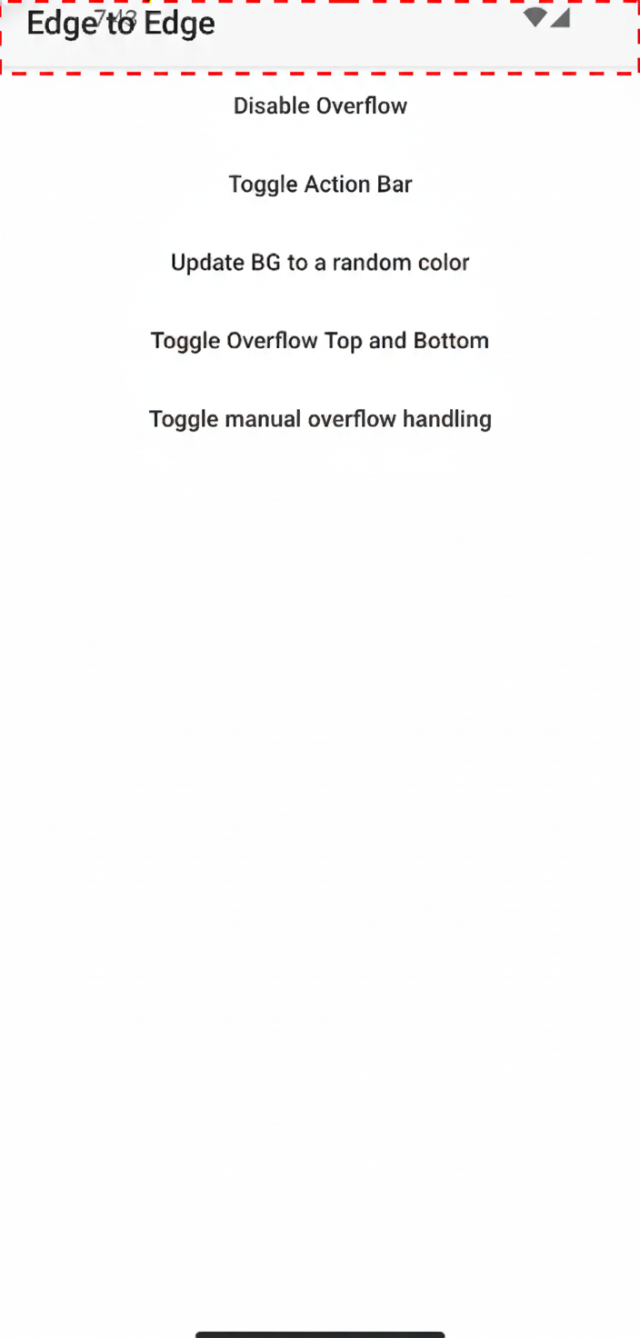
1. androidOverflowEdge
A layout-level property that controls how a view interacts with system insets.
Conceptually, this answers the question:
Should this view apply system insets automatically, ignore them, or selectively consume them?
Typical use cases:
- Pages that should draw behind the status bar (hero headers)
- Toolbars that must respect the status bar height
- Full-screen content like maps or media players
2. androidOverflowInset Event
When a view chooses not to auto-apply insets, NativeScript emits this event, androidOverflowInset, with the raw inset values.
This allows you to:
- Apply padding or margins manually
- Consume only certain edges (top, bottom, left, right)
- Coordinate inset handling across nested layouts
3. Utils.android.enableEdgeToEdge()
A helper that enables edge-to-edge mode on the current Android Activity and configures system bar appearance.
This is where you:
- Opt into edge-to-edge rendering
- Control status bar / navigation bar colors
- Handle light vs dark system icon contrast
Basic Setup
Enable Edge-to-Edge on the Activity
import { Application, Utils, Color } from '@nativescript/core';

const activity = Utils.android.getCurrentActivity();

Utils.android.enableEdgeToEdge(activity, {
  statusBarLightColor: new Color('#ffffff'),
  statusBarDarkColor: new Color('#000000'),
  navigationBarLightColor: new Color('#ffffff'),
  navigationBarDarkColor: new Color('#000000'),
});
Enabling Edge-to-Edge on a Window (Dialogs)
Utils.android.enableEdgeToEdge also works directly with an Android Window, which is useful for dialogs, bottom sheets, and custom window-based UI.
Utils.android.enableEdgeToEdge(activity, window, {
  statusBarLightColor: new Color('#ffffff'),
  statusBarDarkColor: new Color('#000000'),
  navigationBarLightColor: new Color('#ffffff'),
  navigationBarDarkColor: new Color('#000000'),
});
If you do not need custom colors, you can simply do:
Utils.android.enableEdgeToEdge(activity, window);
This allows dialogs to fully participate in edge-to-edge rendering instead of falling back to legacy inset behavior.
Using androidOverflowEdge
Default Behavior
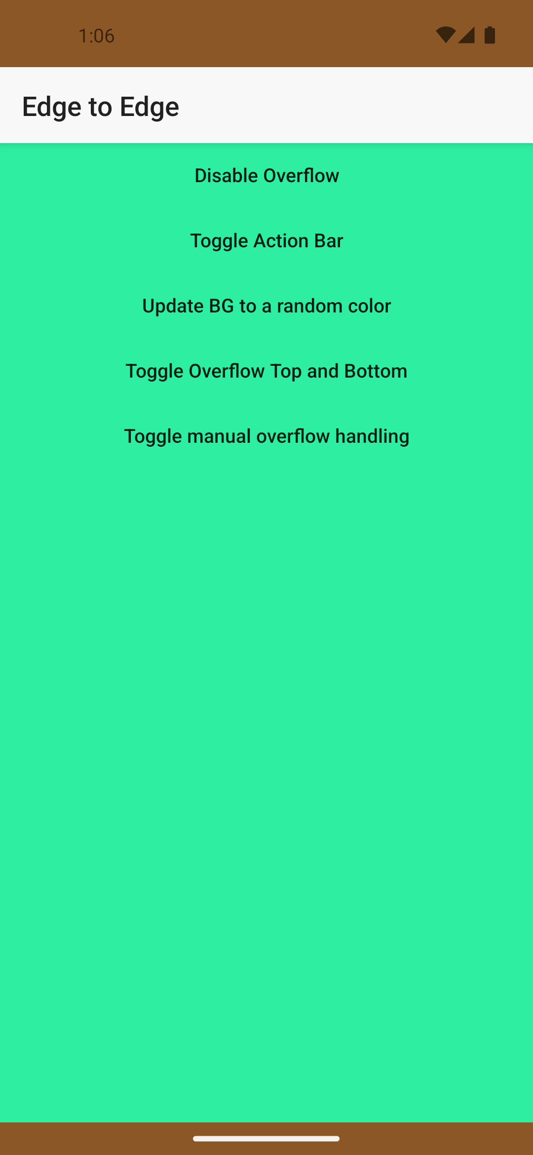
By default, NativeScript will apply system insets automatically so most layouts continue to work without changes.
Pages are now drawn behind the status and navigation bars, setting a background will behave similar to iOS backgroundSpanUnderStatusBar.
 However, when you need finer control, let's look at a few examples.
Example: Page That Draws Behind the Status Bar & Navigation Bar
page.androidOverflowEdge = 'top,bottom';
This tells NativeScript:
- Do not automatically add padding for system bars
- Overflow the top (status) & bottom (navigation) bars
Advance Usage
There are times when your page needs to go beyond the top, bottom, left & right overflowing. For those moments I'd recommend manually handling the insets.
A solid use case for manual handling of the insets on a page is when an overflow of top & bottom is needed but you need to handle the margin/padding on the child views separately to gave it a nice fluid look so using androidOverflowEdge="top,bottom" would not work in this case. Even if we added some 🌟magic🌟 margin numbers based on the screen density there would still be extra space edge cases.
Bear in mind the bottom inset can vary due to the selected bottom navigation mode.
To fix this we can use dont-apply and set the inset listener.
page.androidOverflowEdge = 'dont-apply';
This tells NativeScript:
- Do not automatically add padding for system bars
- Deliver raw inset values via the event instead
Handling Insets Manually
Once auto-application is disabled, listen for androidOverflowInset event:
class MyComponent {
  page: Page; // your Page reference
  inset = {
    top: 0,
    right: 0,
    bottom: 0,
    left: 0,
    ime: {
      top: 0,
      right: 0,
      bottom: 0,
      left: 0,
    },
    cutout: {
      top: 0,
      right: 0,
      bottom: 0,
      left: 0,
    },
  };
  constructor() {
    this.page.on('androidOverflowInset', (args) => {
      const inset = args.inset;

      // store inset
      this.inset.top = inset.top;
      this.inset.right = inset.right;
      this.inset.bottom = inset.bottom;
      this.inset.left = inset.left;
      // ime can be used to handle the opening/closing of the keyboard
      this.inset.ime.bottom = inset.imeBottom;

      this.inset.cutout.top = inset.cutoutTop;
      this.inset.cutout.right = inset.cutoutRight;
      this.inset.cutout.bottom = inset.cutoutBottom;
      this.inset.cutout.left = inset.cutoutLeft;

      // Mark edges as consumed so parents do not re-apply them
      inset.topConsumed = true;
      inset.rightConsumed = true;
      inset.bottomConsumed = true;
      inset.leftConsumed = true;
    });
  }
}
Why Consumption Matters
Inset consumption prevents:
- Double padding in nested layouts
- Conflicting inset logic between parent and child views
Think of it like event bubbling; whoever handles the inset should consume it.
Common Layout Patterns
Toolbar That Respects the Status Bar
- Page:
dont-apply - Toolbar: manually padded with inset.top
- Content: starts below toolbar
This avoids the classic toolbar under status bar on API 35+.
Full-Screen Content (Maps, Video)
- Root view ignores insets
- Overlay controls manually padded
- Bottom navigation reacts to gesture bar height
This matches modern Android UX expectations.
Dark & Light System Bars
When enabling edge-to-edge, you are responsible for icon contrast.
The utility API allows separate colors for light/dark modes so NativeScript can automatically toggle system icon appearance.
Forcing Light or Dark Mode
In addition to automatic behavior, you can force light or dark system UI using the handler callback. This is useful when:
- Your app has a fixed theme
- You need predictable system bar contrast
- You are synchronizing system UI with an in-app theme switcher
The handler lets you override the system's night mode decision and explicitly control which appearance is applied.
Best practice:
- Force only when necessary
- Keep system UI consistent with your app theme
- Test contrast carefully for accessibility
Best practice:
- Use transparent or near-transparent bars
- Let content extend underneath
- Ensure contrast meets accessibility guidelines
Migration Tips
Existing Apps
If your app suddenly looks off when targeting API 35:
- Enable edge-to-edge explicitly
- Identify views that must respect system bars
- Move inset logic closer to the views that visually need it
Incremental Adoption
You do not need to convert everything at once.
- Leave most layouts on default behavior
- Opt into manual handling only where necessary
Common Pitfalls
- Forgetting to consume insets leads to double padding
- Applying insets at multiple hierarchy levels
- Hard-coding status bar heights
- Assuming pre-Android-15 behavior
The new API exists specifically to avoid these issues.
Final Thoughts
Edge-to-edge is no longer optional on modern Android; it is the baseline.
NativeScript's Edge-to-Edge API is intentionally low-level and composable, giving you the same control Android's native APIs provide while staying idiomatic to NativeScript's layout system.
Once you start thinking in terms of who owns the inset, complex layouts become predictable and robust.