Adding a Material Design CardView to a NativeScript App
Learn how to incorporate a Material Design CardView component in your iOS and Android apps.
One of the most popular mobile user interface components today is the card (a.k.a. CardView).

Individual cards are typically used to display information about a single component or subject in a visually distinctive manner. The Material Design system from Google has become a gold standard for engaging UI, so being able to leverage these components in your NativeScript app is more in demand than ever.
While the NativeScript team (and our community) work towards full Material Design support, it's awfully handy that other folks are starting to fill this gap with a variety of NativeScript plugins. Take for example, the nativescript-cardview plugin from Brad Martin. This plugin implements the Material Design CardView component for both Android and iOS.
Yes, we will soon have a much bigger announcement around Material Design support in NativeScript! 🤫
Show Me Some Code
Like any other NativeScript plugin, you install it with a simple command:
tns plugin add nativescript-cardview
If you are developing a plain JavaScript or plain TypeScript (as opposed to Angular or Vue.js), make sure you add the appropriate namespace to your <Page> element like so:
<Page xmlns:Card="nativescript-cardview">
Your markup should then include a layout container and the CardView component. Something like this:
<StackLayout class="p-20">
    <Card:CardView>
        <StackLayout>
            <Label text="Hello World!" />
        </StackLayout>
    </Card:CardView>
</StackLayout>
TIP: If you're using Angular, you can see some similar sample code here.
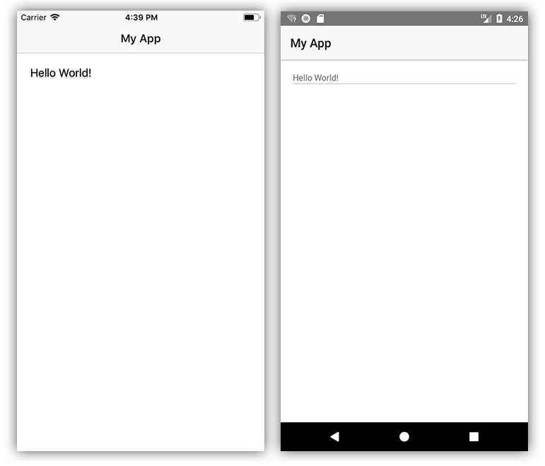
This will lead to a UI that looks like:

Wait a minute. Doesn't look so cardy to me. Looks like we need to add some CSS to spice things up. 💃
Let's throw some class properties on our <CardView> and <StackLayout> elements:
<Card:CardView class="cardStyle">
    <StackLayout class="cardContent">
And follow it up with the associated styles in our app.css file:
.page {
    background-color: rgb(237, 237, 237);
}

.cardStyle {
    background-color: #fff;
    color: rgb(43, 43, 43);
}

.cardContent {
    padding: 20;
    font-weight: bold;
    font-size: 30;
}
Alter our text a little and throw a cute kitteh picture in 🐈:
<Label text="Hello Kitteh!" class="m-b-10" />
<Image src="https://placekitten.com/200/200" />
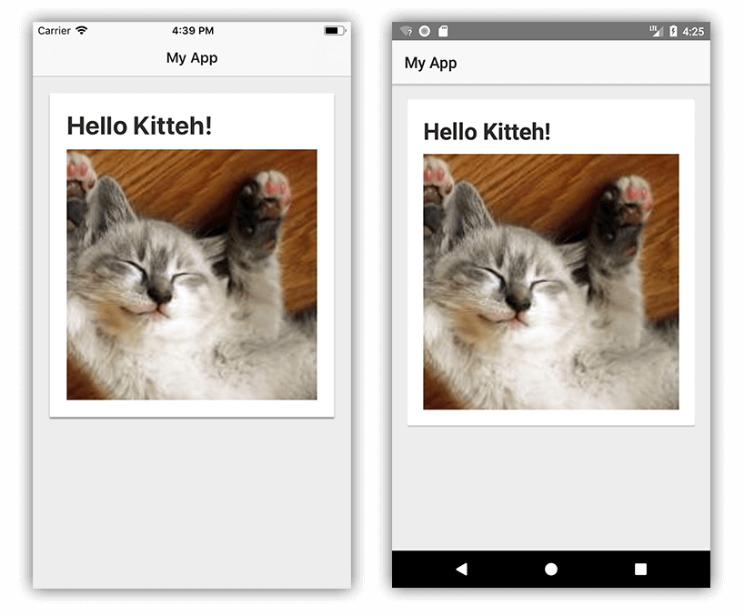
...and we get something that looks like the card UI we were expecting all along!

Custom Attributes
A tricky aspect about the nativescript-cardview plugin is that there are separate unique attributes for both iOS and Android implementations.
You can apply a radius to an element to customize the border-radius. (This actually works the same on both platforms).
Shamelessly ripped from the plugin documentation, here are the platform-specific attributes (all are optional):
Android-Specific
elevation int (consider this the intensity of the "drop shadow" behind the card)
ripple bool (set this to "true" to show a ripple action when you tap the card)
iOS-Specific
shadowOffsetWidth int (set the x position of the shadow)
shadowOffsetHeight int (set the y position of the shadow)
shadowColor string (set the color of the shadow)
shadowOpacity int (set the opacity of the shadow)
shadowRadius int (set the radius of the shadow - different from the radius of the card itself)
{N} Plugins FTW 🔌
You can discover a plugin for virtually any scenario (not to mention app templates and code samples!) on the NativeScript Marketplace.