A Deep Dive into NativeScript UI's Calendar
The final article in our "week of NativeScript UI" series focuses on the Calendar control which allows you to easily leverage the native iOS and Android calendar UI.
If you asked a group of developers, "What is the most difficult UI to implement?", I would guess a majority would have something to say about dates, calendars, and scheduling. Calendars are hard. Leap years, holidays, weekends - it's too much for someone to have to manage. You shouldn't have to remember "30 days has September..." in lieu of writing code.
When you throw "mobile" into the mix, it gets all that much more complicated. How do you create an effective UI that balances a small canvas with a month's or even a year's worth of event data?
NativeScript UI to the rescue! NativeScript UI is a clean abstraction on top of native calendar UIs provided by iOS and Android. With NativeScript UI we are building on the Telerik tradition of providing easy to use components that delight developers with their ease of use - and delight end users with their engaging features.
This post is part of our "week of NativeScript UI" that goes into the how-to of each NativeScript UI component. Today is all about the Calendar and is the final article of our series:
- ListView
- Chart
- SideDrawer
- DataForm
- AutoCompleteTextView
- Calendar
What is NativeScript UI?
NativeScript UI is a set of premium UI components for native cross-platform mobile apps written with the NativeScript framework. Our goal is to simplify NativeScript app development by providing pre-built, ready-to-use, components that are easy to implement in your app (and equally as easy to style to match your app's look and feel).
Let's get started with learning all about the Calendar component.
Calendar (a.k.a. RadCalendar)
The Calendar component (known in code as RadCalendar), exposes a unified API on top of the native calendar controls provided by iOS and Android. No more individual, platform-specific implementations of event/scheduling UIs. With RadCalendar we do the heavy lifting for you and grant you the ability to add complex, mobile-optimized UI widgets to your app with a minimal amount of code.

RadCalendar allows you to display events inline (as in the above example), customize your week/month/year views, style calendars with CSS, and handle calendar events based on user interactions.
Installing NativeScript UI's Calendar
Navigate to your NativeScript project directory and install NativeScript UI Calendar with the following command (no manual download required):
tns plugin add nativescript-ui-calendarGetting Started with RadCalendar
Note that all of the code demonstrated here is available in this GitHub repo. For more code samples, check out the official NativeScript UI sample repo.
Plugin installed? Great! Now we'll need to add an XML namespace to the root of the page where we want to use RadCalendar. If "XML namespace" scares you, have no fear. You just need to add a property to your root <Page> element, like this:
<Page xmlns:calendar="nativescript-ui-calendar">
Next, we need to add a RadCalendar component to our XML markup, as in:
<Page xmlns:calendar="nativescript-ui-calendar">
    <calendar:RadCalendar id="myCalendar" />
</Page>
Believe it or not, a code sample this simple resolves into a nice looking calendar:
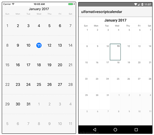
But let's add some events and see what else RadCalendar can do for us!
Adding Event Data
RadCalendar allows us to easily add event data via the CalendarEvent class, which describes a single event and exposes a variety of properties.
Let's start by making some minor changes to our XML markup:
<Page xmlns="http://schemas.nativescript.org/tns.xsd" xmlns:calendar="nativescript-ui-calendar" loaded="pageLoaded">
    <ActionBar title="RadCalendar Demo" class="action-bar" />
    <calendar:RadCalendar id="myCalendar" eventSource="{{ events }}" />
</Page>
What changed?
- We added a
pageLoadedfunction to theloadedevent (see below). - We inserted an
ActionBarto show a title in our view. - We added
eventSource="{{ events }}"to associate the data source with our calendar.
Next, let's add some code to our JavaScript code-behind file:
var Observable = require("data/observable").Observable;
var calendarModule = require("nativescript-telerik-ui-pro/calendar");

var page;
var pageData = new Observable();

exports.pageLoaded = function(args) {
    page = args.object;
    page.bindingContext = pageData;

    var eventTitles = ["Lunch with Steve", "Meeting with Jane", "Q1 Recap Meeting"];
    var events = [];

    var j = 1;
    for (var i = 0; i < eventTitles.length; i++) {
        var now = new Date();
        var startDate = new Date(now.getFullYear(), now.getMonth(), j * 2, 12);
        var endDate = new Date(now.getFullYear(), now.getMonth(), (j * 2) + (j % 3), 13);
        var event = new calendarModule.CalendarEvent(eventTitles[i], startDate, endDate);
        events.push(event);
        j++;
    }

    pageData.set("events", events);
}
In this code sample we are providing some fake event data to our calendar. The key line of code is this:
var event = new calendarModule.CalendarEvent(eventTitles[i], startDate, endDate);
This is where we are creating the individual event with the CalendarEvent class. Note that the startDate and endDate variables are just plain JavaScript date objects!
Looking for Angular code samples? Check out our complete docs for Angular as well!
This results in the following changes to our calendar app:
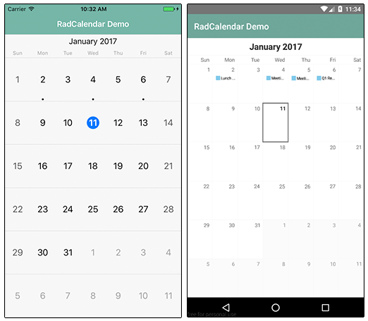
Note that the styles you see come from the core light theme that is part of NativeScript, plus some customizations made with the NativeScript Theme Builder.
Viewing Event Data
We have data in our calendar (which we can see based on the dot in iOS and the short event preview in Android). However, we'd like to actually see the event data somehow!
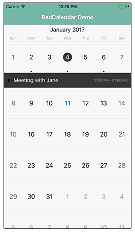
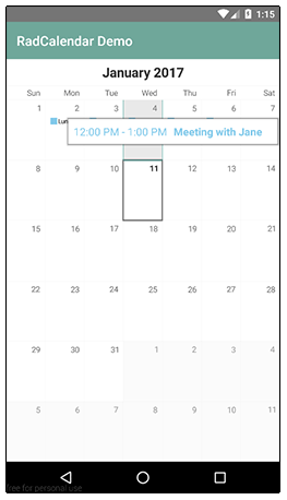
This is accomplished using the event view modes provided by RadCalendar. By tweaking our markup, we can see our event data either Inline or via a Popover:
<calendar:RadCalendar id="myCalendar" eventSource="{{ events }}" eventsViewMode="Inline|Popover" />
Inline on iOS:
Popover on Android:
Changing the Calendar View
Now we don't always want to see our calendar in the full month view (which is the default). In scenarios where you want to show a different view of dates, you can use the RadCalendar's viewMode property, which supports the following options:
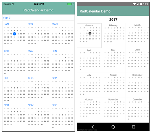
Week(displays one week of dates)Month(displays one month at a time - default)MonthNames- (shows all month names in a year)Year- (shows us an entire year of days on one screen - see below)
Fancy Calendar Transitions
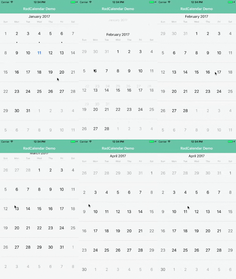
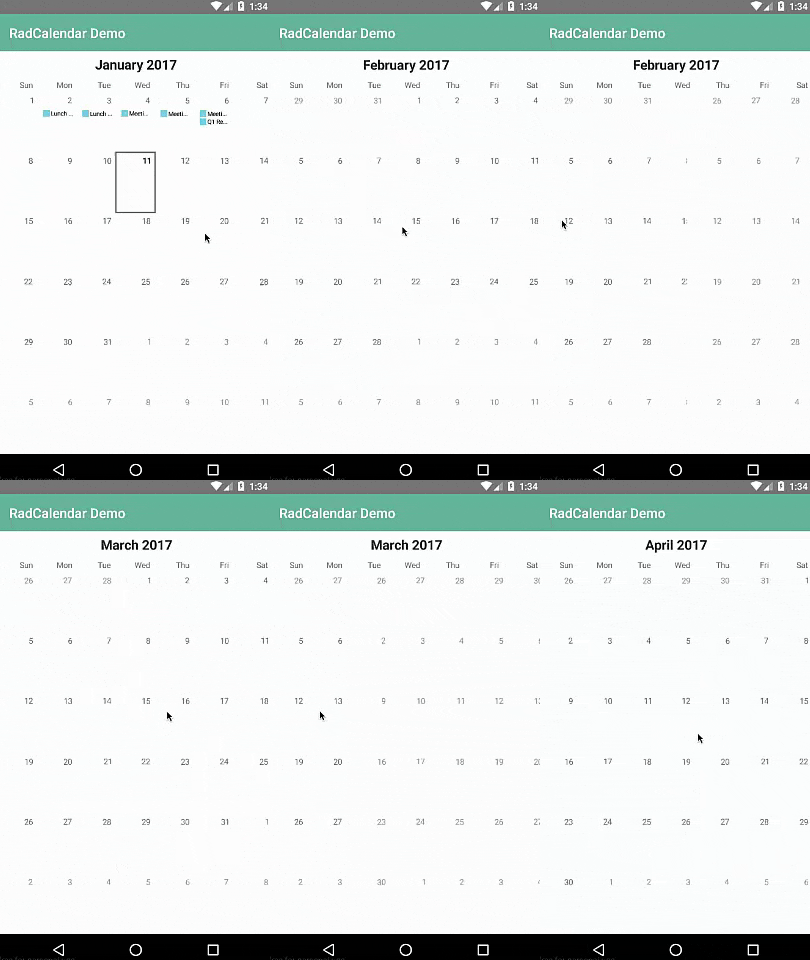
When swiping to move between weeks/months/years, NativeScript will use the host platform's native transitions. With RadCalendar, you can specify different transition modes:
- None
- Slide
- Stack
- Flip (iOS only)
- Fold (iOS only)
- Float (iOS only)
- Rotate (iOS only)
- Plain (Android only)
- Free (Android only)
- Combo (Android only)
- Overlap (Android only)
You can try out these transitions by setting the transitionMode property of your RadCalendar. Here is an example of the Stack transition on iOS and Android:
Anything Else?
RadCalendar allows you to create customized calendar controls with ease. Imagine adding a RadDataForm to the mix to create a fully-capable scheduling system!